Pedigree continues it’s dominance of consumer insight and creativity.
Image
Reply

Few ads can engage the viewer like this on, I dare you…he’s in there…and you will remember the purpose of the ad. Job done.

An older one, but a good one.
I still recall first seeing this and it making me smile. A little irreverent and beautifully produced.

It seems obvious, but most vegetarians dont want their food associated with meat.
A classic case of not understanding your target market.


Rarely do you see a campaign that is creative and consistent. It isn’t changed at the whim of a new agency or new brand team, it perseveres with a good creative idea, well executed and above all brilliantly branded.
The colour way, the art direction, even the logo all show clear adherence to the original expression.
I love it. Even without a Dog.


Posted previously, but I’m compelled to bring it back to the top of the pile for another outing.
LEGO has certainly become an incredibly flexible brand without losing it’s core promise of creativity and imagination – as brilliantly established in its classic 1981 Mike Cozens “Kipper” ad, still one of the best ads ever made, particularly as I remember seeing it is a young LEGO fan…(interestingly the impressionist Roger Kitter not Tommy Cooper does the voiceover):


A brilliant product demonstration (…as many good ads are). I just hope a security guard was close at hand.
PR stunt perhaps? But more seriously, a poor and very amateur attempt at advertising. Many comments in social media hark back to a more ‘open’ time in 1970 something. Exactly. And the charity sign-off doesn’t excuse the execution.
I’ve posted a succession of great Bonds work.
It is one of the best examples of campaign consistency. Sexy, fun ads for the target that are really great product demonstrations. Relevant, interesting and motivating from an emotional and rational point of view.

All with well crafted soundtracks (particularly the Baby “Zip It” work). And great product names / descriptors. Simple, but effective.
I hope with the changes at the company they stick to the plan – all too often the need for change in a campaign can be client rather than consumer.
Bonds remain a cool and clever brand.
Some other examples: blokes, babies, hipsters, rollers, others…
Clemenger BBDO Melbourne have made a new blokes beer ad. It’s good to see a big ad for a big Aussie brand taking centre stage again.
Enviable ad budgets, blokes, beer, it’s all there, but there is a nice quirky ’80’s movie parody idea behind it that supports Carlton Draught‘s ‘Made From Beer’ positioning. We expect a lot from big brand beer ads and this one delivers.
The ad takes you on an entertaining story and is played out with some nice touches with a good deal of mirth.
If Carlton want to be a bit blokey, young, fun and trendy, then this should work wonders.
A nice touch was the fact it was distributed to the AFL database before it is aired in the ‘footy’ finals on Friday night.
Advertising Agency: Clemenger BBDO, Melbourne, Australia
ECD: Ant Keogh
Art Director: Ant Phillips
Copywriter: Richard Williams
Managing Partner: Paul McMillan
Director: Steve Ayson
Managing Director: Andy Traines
Producer: Cindy Kavanagh
Head of Production: Renee Robson
Production Supervisor: Gus Kousoulas
Editing: The Butchery
Tourism Australia and Qantas have rejigged Icehouse singer Iva Davies Great Southern Land track.
The aim is to sell Australia to tourists.
The first thing that surprises me is that this is more music video than tourist ad?
The second thing is that It will run online only, including Twitter and TA’s Facebook page.
And this is on the back of DDB’s most recent incarnation of the There’s Nothing Like Australia campaign, which cost $4m to produce.
I’m not convinced that a song which means more to Australians than any other nation, sung by artists mainly recognizable only by Australians will attract a flood of foreigners?
And no surfing on golden beaches?
This will have to work very hard via social media if it is to attract the traveler in the face of a strengthening Aussie dollar and I can’t help thinking it is another montage of nice shots and song rather than a strategic advertising effort.
An Australian version of this ad drew complaints post a recent spate of shark attacks.
The ASB on giving it the all clear noted consumers’ could interpret the ad as distrespectul given the recent shark attacks, but ruled it didn’t breach Section 2 of the Advertiser Code of Ethics and was in line with health and safety community standards.
The Bureau argued: “Catching or riding a shark is completely unrealistic and most of the community would see this as being fabricated for the purposes of selling the product”.
The brand, owned by Pepsico Australia Holdings, responded: “This commercial was not intended to be insensitive to those who may have suffered in shark attacks. The tone of the advertisment is humorous […] and clearly ‘over the top’ and not intended to replicate in way any real life experience.”
I think an interesting point is the depiction of the shark. Mountain Dew show the shark in full Jaws mode i.e. scary.
A similar effort from Arena takes a different and more relevant approach and is probably better for it. Sharks and any depiction of potential killer instinct at work is tricky at the best of times, let alone when the sharks are attacking swimmers.
![]()
This is a funny ad, particularly for all the parents out there.
But it also continues in the IKEA tradition of delivering the simple proposition of low prices and decent quality (value).
It is a rare example of an arresting bit of creative that gets your attention and ensures that you remember the advertising message.
Nice work by The Monkeys.
It was bound to happen given the earnest nature of the initial Toni Collette effort.
A bit cheeky, but fun for a tactical moment.
The bank is now investigating whether the parody breaches its intellectual property rights. You would not want to get into a legal battle with these billionaire bankers.
Clearly Commbank spotted this parody very quickly, unlike it’s appalling and “unapproved” Backpack Bomb hoax ad that aired on-line for the Olympics.
The parody has now been removed courtesy of Commbank.
Here is a truly iconic brand that has consistently been in shopping baskets since first sold in Fortnum & Mason in 1901.
Most of us still associate it with the famous 1967 “Beanz Meanz Heinz” slogan created by advertising executive Maurice Drake.
In other words it is a true perennial that is still in most households.
I love this ad because it shows some proper insight on the shopper. It relies on the fact that most of us have a can, but many of us have lapsed with our usage if not love of the beleaguered bean.
The message immediately resonates with the viewer. It reminds us of a neglected friend hidden away that deserves better!
Tom Ward, head of strategy and insights at GPY&R, said:
“The problem is that all too often that is where they stay, to the point that people will sometimes end up with two or three cans tucked away.”
This sort of genuine shopper insight is great to see. Hopefully the campaign will grow as we see how people have rekindled their love affair and bust out the beautiful bean…
Kimberley Clark are going out of their way to push the problem.
It might be “leakage” or it could be the risk of attracting dogs by virtue of an unclean bum (ref Kleenex Cottonelle).
This latest effort is confronting women with what we are told is a common problem. The solution is U by Kotex.
In both cases the company tackles the problem with clear product solutions.
Both approaches and that of Carefree raise an interesting question. Do consumers respond better to direct, descriptive advertising and what level of directness is more effective? The word “vagina” has recently been a subject of many complaints regarding the advertising campaign for Carefree Actifresh.
It’s interesting to ask if this approach researches well with all women / consumers? The industry likes to trumpet from on high and say we MUST change the consumer – “better out than in!” and remove ourselves from these suppressed notions of discrete advertising…? A vocal minority applaud the use of language that can make mums and dads cringe into their sofa. “It’s a vaginal discharge so lets herald it from on high!”. I’m not so sure.
There is a subtle balance between being direct and being overtly confronting to women and families in their own living rooms. U, which is firmly youth targeted, gets it right. We aren’t shocked into awareness of the problem and efficacy of the solution, we don’t hear language that is too confronting and we are indirectly very aware of the problem without being told that it is a “vaginal discharge”…territory other brands would prefer to own.
At the end of the day it is about understanding the audience not just the user and when it is the mass medium of TV the family audience matters. This is why it is an interesting topic for discussion when used in mass market media (rather than more directly targeted communication).
Without being overly conservative I sincerely hope that brands don’t continue to reach for stand-out notoriety by the use of the lowest creative common denominators in overtly describing what many real people consider to be discrete categories.
The true creative challenge is to communicate the problem and benefit / solution without the reliance on the literal descriptions and language.
![]()
After much anticipation the new Qantas campaign has launched.
The ad features the new tagline “You’re the reason we fly” with a Daniel Johns track, titled “Atlas”. Somewhat put in the shade by the latest Telstra “Land Down Under” track. The ad also has a new logo, a compilation of 22,000 Australian faces which make up the flying kangaroo.
It’s interesting that the campaign has dropped the famous song “I still call Australia Home” and has also moved away from iconic Australian images.
Featuring real people is a “see-through” strategy to ensure that “real” people feel that this is their airline (and that’s the reason they fly…). It hopes to be relevant to them and that they will relate to it. As an iconic national carrier, that has arguably lost it’s way, this is quite a risk. The notional change from “Australia’s” to “Australian‘s” airline indicated that this was coming.
The question is what does the ad do to either inspire people afresh or change attitudes? And there is a bit of a negative mountain to climb in many travelers minds both perceived (press negativity) and experienced (the entertainment isn’t working, it’s late again etc)
Emotionally it engages through the everyday people it hopes to be relevant to. Some nice shots and as you would expect beautifully produced. The launch campaign is customer-focused, featuring Australian’s from the coast, the cities and the country, a destination-based TVC will follow.
Unfortunately the depiction of everyday people is somewhat generic. The “reasons to believe” or think differently about the carrier are absent.
I believe advertising must have a creative message that sells (really!). I’m not sure what I am asked to buy in this ad or what attitude I am expected to change? In other words it is generic.
The previous ad famously became an anthem for all that was great about Australia (and delivered by Qantas).
This seems to lack any proprietary backbone in terms of what is unique about Qantas. Owning the place was one thing that resonated as it is a national carrier going to all parts of the country (less true these days). Owning the people is quite a different proposition that relies on delivering superb service which judging from on-line comments is somewhat lacking of late.
In comparison to the Virgin ad which stressed a fast pace and determined approach to service (…showing staff, service and boasting a lot of planes no less!), this ad falls short on delivering a message that you can grab hold of and believe in. At this stage in the brand journey, people need a bit more substance to believe in.
The compilation logo treatment has a lot more style than substance and is perhaps too wrapped up in the strategy of “Australian’s” versus a clear depiction of the logo, particularly when there are no other clear brand references in the ad – I believe that you can never assume that everyone seeing it knows who it is for.
I completely get where the ad is trying to position the brand, I’m just not sure it is as convincing as it needs to be.
As a recent article put it the new generation of traveller has no emotional attachment to Qantas and its wider significance to the country, also suggesting that:
Qantas is coming home to an empty house, with a sign pinned to the fridge saying, “Your chicken dinner – or beef dinner if we cannot fulfil your first choice – is in the dog” and an ever-growing stack of bills to pay.
A lot of work to be done to change hearts and minds.
Qantas has said that the TVCs are designed to tug on the “heart strings” and to “re-engage emotionally with consumers”.
The final stage of the campaign, which Qantas has labelled the ‘prove’ segment, will make up the lions-share of the rebrand efforts.
Is this another example of the consumer being gently introduced into the sell via a soft emotionally charged entrée? It seems to be a trend amongst bigger budget brands to “engage” emotionally first then sell second with proof points (Commonwealth Bank, Virgin Mobile, Woolworth’s etc).
The cynical might suggest this could be a clever sales tactic by agencies. But I think it is flawed to assume that consumers are interested enough to stay with brands through these different phases (and connect them). The better option is surely to make a single ad (or connected campaign) which can receive significant weight and generate the desired impact emotionally AND rationally (Hyundai, Cannon, The Guardian etc)
The team at Qantas are skilled marketeers with broad budgets and I hope that the rational reasons to fly with them (the proof) will be delivered in the next ad against this emotionally staged backdrop of relating to everyday people.
The problem with this execution is a basic one – marketing 101 really:
“what is actually proprietary and unique about this ad”?
The answer is very little. Added to which, the ‘You’re The Reason We Fly‘ tagline is exactly the same wording used by the now-defunct Carnival Airlines in the USA.
As reported in AdNews, creative leaders have not suggested Qantas plagiarised the positioning, they have chastised the company for using a “generic” statement that could have been used before, and for “not doing their homework”.
McCann executive creative director John Mescall told AdNews: “It’s not surprising this has happened because it is such a generic motherhood statement. This is laziness not plagiarism.
A lazy, generic approach to advertising and the assumption that consumers will be interested enough in the emotional “art” to act or change opinions, shows a lack of insight into the consumer, the category and a lack of belief in the brand’s selling points (which are absent).
Ultimately everyday people will judge this work versus the previous iconic work and more importantly, they will judge the airline by the delivery of a decent service in a highly competitive market.
Unfortunately, I think that this work will fly by them relatively unnoticed.
Much of my recent postings have been around the subject of “taste”.
This is taste in terms of what advertising should and shouldn’t say and suggest around traditionally taboo subjects. As well as examples of poor taste propped up by the excuse of irreverence and tongue in cheek (Lynx being a shocker)
Some would argue that taste is a subjective measure of what we as individuals deem appropriate as advertising.
I think that the question of taste or advertising standards is more than that. We need to arbitrate in these matters on behalf of the mass market majority who are exposed to the advertising – particularly when it is on TV. Rather than crushing creativity, this should actually prompt more ingenious, imaginative solutions to communication.
The creative community can argue that we should break these taboos – use the word vagina when discussing feminine hygiene. Show explicit imagery to demonstrate problems (accidents / disease etc). Many might suggest that we are lessening the creative impact by embargoing these words and images.
At the risk of sounding conservative on creativity, I don’t agree.
I think that this ad is a beautifully produced ad. It captures the attention and the dialogue is relevant and motivating to the target. The last thing it needed was the seemingly gratuitous inclusion of the word vagina. I don’t think this inclusion adds anything to comprehension or awareness of the message. It just shocks the casual viewer, as in “did they just say that”?
Are we to imagine that the target didn’t get the message and needed to be alerted to it through hearing vagina in the monologue?
In the words of Johnson & Johnson:
“We have decided to take a bold approach in this campaign with the aim to tackle a subject which has always been taboo.”
I don’t think the language is going to make this a bold ad on a taboo subject.
There is a lot of debate on it at present. Daye Moffitt, brand strategy director at creative agency Moon, offered a female perspective.
“Personally, it makes me cringe, but that’s not necessarily a bad thing and I do think it is a good strategy. The shock tactic helps with getting young women to listen up – it gets their attention in a very loud marketplace. It’s an effective and memorable ad, certainly.”
With the greatest respect to Daye, I think that cringe is the issue – imagine how parents with teenage boys respond when they hear it.
As anticipated the Australian Advertising Standards Bureau has received over 30 complaints since the ad first screened on Sunday evening. A spokesperson for the ASB said:
“Most of the complaints are about the terminology that’s used and the nakedness of the woman,”
Interesting that the nudity got so much attention, suggesting how conservative our viewers really are.
The creative challenge reaches beyond the use of explicit or provocative language. And “vagina” can be considered as explicit language to many in the mass market living rooms.
Creativity needs to find new ways of reaching into the consciousness of viewers. Ways that don’t rely on gimmicks, tricks and controversy.
The ad is good, not great, and the inclusion of the word vagina merely serves to draw attention to the word not the problem or brand. Probably at the cringing discomfort of many women who would rather not shout it loud and proud from the living room floor.
These women are after all the target market and discretion in communication is perhaps more relevant and motivating than the vagina monologue.
![]()
Every bit of me says I should lambast this work.
Here we have the legends (Grandfathers…) of Rock, the mighty Status Quo, reworking their 1975 hit, ‘Down, deeper and down’, to include Coles’ ‘Down, down, prices are down’.
Quo’s original track was the inspiration behind the supermarket’s grating, but memorable tune introduced last year.
But before I drift off into dismissive hyperbole about the demise of the once great ad industry, a few salient thoughts:
The overall impression isn’t therefore that this is a credible Rock band selling out, it’s more a case of here are some ageing Rockers having a laugh at the expense of Coles.
At the same time it delivers the message and as a nod to the original tune is a bit of fun (if a bit of a cringe at the same time). This should appeal to a lot of the mass market and get the tune lazer etched into everyone’s subconscious.
Red guitars on sale in-store apparently.
Funny for a moment, but I only hope we don’t have to endure the joke too often on our screens!
Here are the boys doing their bit:

Just a great piece of work that shouts great insight. It draws you into the message.
Love the series.

“Choose Later – Up to 130 consecutive shots.”
Advertising Agency: Giovanni+DraftFCB, Sao Paulo, Brazil
Chief Creative Officer: Javier Campopiano
Executive Creative Directors: Benjamin Yung Jr., Cassio Zanatta
Copywriter / Art Director: Adriano Alarcon
Photographer: Zarella Neto
We now firmly understand that a labrador puppy is the spokes-dog for toilet paper.
Usually he sprukes soft, strong and very, very long. And because he is soft and cuddly, we naturally assume that the product has similar qualities. We don’t often question if these are the properties that make it the best toilet paper, probably because it’s not something we choose to debate and discuss.
So it’s interesting to see Kleenex apply this more direct approach to the category.
Basically, does your bum smell?
After the initial shock of being confronted by such a direct accusation, we can consider what the ad is trying to do.
The cute puppy, is now less interested in playing with toilet rolls and is more interested in being a dog and smelling bums. Those that use Kleenex pass the test. Those that don’t get a yelp of terror from our cute character assassin.
Kleenex have made one concession to our potential embarrassment by making up a new word for textured toilet paper – gripples. To me it sounds a bit like a grade of sandpaper and perhaps not as cumfy as it is meant to. They are trading off this imaginative invention:
Here is what the company says in a press release from Kimberly-Clark:
“While a little edgier than previous Kleenex Cottonelle brand campaigns, the aim is to attract more premium brand switchers, who represent 60% of the market, by communicating the strength of Kleenex Cottonelle as well as the softness it’s renowned for.”
Marketing manager for Kleenex Cottonelle brand, Michelle Rossier said:
‘People use personal care products to feel clean and fresh all day, however they don’t connect this feeling to the toilet tissue they buy. The new campaign positions Kleenex Cottonelle brand as the toilet tissue that provides you with a superior level of clean.”
On the one hand (pun intended) this is a very different move in the category. It will get noticed.
On the other, do people want to be confronted by such a direct message?
My view is that it works to build awareness, but NOT brand engagement amongst the mass market. It has the cute credentials of the puppy to defuse a very direct commentary on hygiene and might perhaps, through the innovative invention of gripples, combine enough rational reasons with the emotion of our previously polite puppy to put this brand at the top of the shopping list. But that is a big “might” in the mass market shopping aisle.
Whilst it is great to see some difference in one of those tricky categories, I think this is missing the true insight on real consumer attitudes and the client has been sold “difference” against “effectiveness”.
The association to a dog sniffing a bum (and what we mean here is poo!) is at odds with what consumers want from the category – i.e. discretion and effectiveness without the overt reference to usage. No one wants to badge themselves in this category!
Just like the Care Free “Vagina” ad, the literal use of contentious words and actions becomes gratuitous and actually isn’t big or clever from a creative point of view. Very few brands successfully shock us into the sell – despite a creative belief that the notoriety of contentious / confronting ads will increase appeal.
As a footnote, I understand that there has been an immediate sales impact on Kleenex. And not a good one. Bummer.

The new campaign is out.
There are a few 15 and 30 second spots coming out and I think this one is the best of the bunch.
A bit more in keeping with the previous work ‘The Man Your Man Could Smell Like‘, which was created by Wieden + Kennedy.
Here are the other two:
Good to see the evolution of the work and very hard to hit the highs of the original.

The LEGO design team are at it again. When they aren’t designing forests in the Australian outback, or producing feature length movies that is.
The company is proud enough (and confident enough) in its designers to allow them some video time to introduce their creations.
The first one I saw was for the exceptional 1962 VW Combi Campervan. The natural enthusiasm of the unscripted monologue from a young designer is infectious.
This example is for their new Haunted House which will be available in September 2012. The designer is clearly a Munsters fan.
What a huge compliment to the designers that they are allowed to release their creations to the public and trade in this way. Their amateur efforts are truthful and completely engaging. They leave you with a memorable impression of the model, its key features and how it came into being. Great examples of “re-used” parts from other kits feature throughout.
The Haunted House is part of the new Monster Fighters line.
I features all of the classic movie monsters (vampires, werewolves, zombies, etc.) against a collection of Victorian-inspired steampunk heroes, led by Dr. Rodney Rathbone, in a quest to obtain the full set of “Moonstones” – which are required to take over the world.

The Haunted House has over 2,000 finger numbing pieces to build the gate, porch, fireplace, kitchen, office, attic, bedroom, potion room and music room, and will sell for $180 for which you get:

I used to work in the toy industry. This LEGO stroke of genius in allowing designers to spruke their wares on-line is the equivalent of us (way back in the day…) getting the designers in front of key retail buyers.
This was always the most effective way to sell toys and LEGO have uniquely embraced this through today’s technology and the social media fascination in the very flexible Billund brick brand.
![]()
Seeing this again still makes me grin and reminds me of why The Campaign Palace was such an innovative agency.
A tongue in cheek dig at the greying market and with a tone of voice and execution that makes it memorable.
Relevant, interesting and perhaps more motivating than the usual dreary in-kitchen vitamin taking to look after the Grand-kids sort of approach.
Great work from the now closing Campaign Palace. Palace chief creative officer Reed Collins:
“In the all too dreary world of pharmaceutical advertising Berocca really stands out. The new Berocca Focus 50+ campaign is refreshingly honest for the category and it’s audience.”
CCO: Reed Collins
ACD: Gerhard Myburgh
AD: Andrew Jones
CW: Hywel James, Paul Bootlis
Producer: Jacqui Gillies
Production Co: Film Construction
Director: Steve Saussey
Producer: Sascha Hodgson
Editor: Gabi Muir
Group Account director: Bruce Davidson
National Marketing Manager: George Reeves
Senior Brand Manager: Nick Lynch
Brand Manager: Kylie Berge

![]()
LEGO is a brand that has successfully re-invented itself.
Licensing innovation and an ability to evolve has been a major part of the strategy. LEGO has realised that it’s functionality and core proposition of creativity expressed as “Just imagine…” can be applied to an abundance of diverse brands and even services.
Some great examples include:
LEGO Technic, originally launched in 1977 and relaunched in the modern format in 1984, made efforts from brands like Frank Hornby’s Meccano redundant to modern kids.
Star Wars LEGO with cheeky characters and amazingly accurate models, relaunching the brand to a generation of new consumers (and collectors).
A LEGO pilot even took to the upper atmosphere courtesy of some enterprising Canadian students:
And I spent a very enjoyable couple of days, unashamedly reliving my childhood by building a LEGO VW 1962 Combi Camper, using all 1,322 pieces of the stuff.
A few sore fingers later and it has pride of place on the mantlepiece and well out of reach of the kids…


Needless to say every great brand is in the sights of a Hollywood producer.
The “Cloudy With a Chance of Meatballs” team of Phil Lord and Christopher Miller is directing “LEGO: The Piece of Resistance” which is a hybrid of live-action and LEGO-based animation. It follows the adventures of “instruction worker” Emmet (voiced by Chris Pratt), a manual labourer in the LEGO world, capable only of following directions from a manual. Will Arnett will voice the role of LEGO Batman. LEGO Yoda, Indiana Jones and Superman will also feature in this battle of good versus evil.

Australian visual-effects house Animal Logic will handle the CGI, which is expected to comprise 80 percent of “LEGO.” The project is scheduled for US release on Feb. 28, 2014.
So despite its plastic rigidity, LEGO has certainly become an incredibly flexible brand without losing it’s core promise of creativity and imagination – as brilliantly established in its classic 1981 Mike Cozens “Kipper” ad, still one of the best ads ever made (interestingly the impressionist Roger Kitter not Tommy Cooper does the voiceover):
If movie licensing and production weren’t enough, this latest collaboration with Google proves LEGO is a brand still innovating in exciting and very relevant new areas.
LEGO and Google have linked up in a new project, called Build, via M&C Saatchi’s digital agency Mark, to showcase the 3D capabilities of Google’s web browser Chrome. The project was produced by Swedish digital agency North Kingdom. It also marks the 50th anniversary of Lego’s launch in Australia.
The campaign allows users to claim their own plots anywhere in Australia and New Zealand, with plans to roll it out globally. Builders can use up to 1,000 virtual bricks to construct buildings and can then share their creations online and with their friends.
To show just how far LEGO has come, Lucinda Barlow, head of marketing for Google Australia and New Zealand said in a press release:
“If a toy could be part of a company’s DNA then Lego would be part of Google’s. We’ve loved working together to create Build, which turns the web into a collaborative canvas where you can create and explore a new Lego world together, online.”
All this from a brick first invented in Billund, Denmark in 1949.
Once in Build, it feels a bit like the early virtual world / second life experience, but you are excused any criticism of reality and pixilation because it’s LEGO.
Also fascinating to see the bizarre buildings already built in my street. Who knew that I had such interesting neighbours!
This latest Google collaboration continues to perpetuate the core brand proposition across another new sector and user group, helping to secure LEGO’s future for another 50 years amongst kids of all ages.
Have a go, but watch out it is incredibly addictive…BUILD
Here is a US ad that has over 4 million views on YouTube.
Many will have participated in the website by sending “Mom” a message of thanks at: http://www.facebook.com/thankyoumom
It was mentioned by BBH’s John Hegarty at Cannes this year in his light-hearted session with Dan Wieden.
Being a fan of BBH, I keep an eye on his comments from Cannes and particularly liked his blunt assessment of much of the work he sees.
This P&G ad is treading familiar, but tricky emotive ground. The old “mom got me here through her dedication to supporting my sport” and presumably cleaning the kit with P&G product. It has been done before in relation to cleaning products, but this certainly isn’t about getting the grime out of the muddy shorts and sweatshirt sort of stuff.
Getting the emotional tone right in an ad is a very hard thing to do.
There was a brilliant P&G Pampers ad that got it right for parents.
On this P&G Olympics ad Hegarty said in conversation with Dan:
“If I had been passed that script and read it I might have vomited. The vomit factor was high if you got it wrong, but you really made it work.
“You have to make sure that the emotions are relevant. It really could have backfired on this.”
Yet again John reverts to the basic principle of relevance to prove the point.
The relevance of this ad to the journey, people and products is there and it is a truly inspiring ad for that reason. Consumers are savvy enough to recognise P&G’s involvement in this journey without seeing too many tubs and tumble dryers.
When I was lucky enough to work at BBH, John said that all advertising strategy needed to be “relevant, interesting and motivating”. I’ve stuck by this and found it to be the best test of a creative idea.
Clearly Hegarty still believes in the basics.

The Guardian newspaper in the UK has a long history of great advertising.
The classic Points of View TV ad is one of the best.
This ad (even at 2 minutes) is my choice from Cannes, although it didn’t bring home the bacon in terms of awards…
It communicates a complicated message of the breadth of Guardian coverage through a brilliantly constructed creative examination of a story we all know. Entertaining, interesting, relevant and motivating by underpinning the credentials of a great paper that is still innovating in the digital world.
A very different perspective and very much what the Guardian brand stands for.
McCann Melbourne creative director Annie Price.
Price has urged Aussie marketers and agencies against treating people like “idiots”, and has held up the highly regarded ‘The Little Pigs’ campaign by BBH as an example of the type of advertising the local industry should be striving for.
She told AdNews: “There’s not much Australian advertising can’t learn from this stunning commercial.
“It’s intelligent. It’s entertaining. It’s beautifully produced and so gripping, it has you coming back for more and more. It really is storytelling at its finest. There’s no doubt who it’s for and you’re left feeling compelled to go and buy a paper.
“It’s the intelligence of the Guardian commercial that most impressed me.
“No denying we make some great ads in Oz.
“But sadly, Australian TV screens are still full of a disproportional amount of commercials that treat people like idiots. Ads that assume that we are sitting there on the edge of our seats, just waiting to be informed about toilet cleaner, muesli bars or moisturiser by a moronic presenter. It’s 1950s advertising without the lovely retro outfits and atomic burst laminate.
“Clients and agencies alike would do well to remember that consumers are getting their information from so many sources nowadays, TV is not king. For us to truly impact on someone’s life via TV, and make a real connection, we’d better be smart about it and we’d better not insult his or her intelligence.”
Hahn by Publicis Mojo wins, but by the skin of it’s teeth as it wasn’t originally shortlisted and got in via a wild-card vote (another peculiar aspect to Cannes voting).
In such a tough category, an interesting choice. Maybe it’s the Night Rider music as much as the action that makes it memorable? It certainly stands out from the beer crowd and has been recognised for the fact.
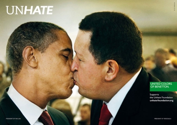
Having just posted about John Hegarty and his view on the state of current advertising (i.e. the ads aren’t good enough). It seems apt to look at the Cannes press Grand Prix winner.
Benetton’s provocative “Unhate” campaign showing world leaders kissing, created by Italian agency Fabrica with help from 72andSunny in Amsterdam got the prize.
Three executions were honored—the ones with U.S. president Barack Obama and Venezuelan president Hugo Chavez; Palestinian president Mahmoud Abbas and Israeli prime minister Benjamin Netanyahu; and German chancellor Angela Merkel and former French president Nicolas Sarkozy.
Absent was the campaign’s most incendiary image—a photo of Pope Benedict XVI kissing a senior Egyptian imam which was pulled almost immediately after the campaign broke last November.
Vatican spokesman the Rev. Federico Lombardi said in a statement cited by The Guardian, after slamming the image as “entirely unacceptable.”
“It is a serious lack of respect for the pope, an affront to the feelings of the faithful and an evident demonstration of how, in the field of advertising, the most elemental rules of respect for others can be broken in order to attract attention by provocation,”
The White House was not amused:
“The White House has a longstanding policy disapproving of the use of the president’s name and likeness for commercial purposes.”
Jury president Tham Khai Meng said that Benetton “has heart impact and gut impact and promotes a global debate”.
Steve Jones, a British juror at the French Riviera event said: “The reason we chose this is because it stood out on the wall… It’s not like traditional advertising. It’s not making a point about the clothes, its brand history. It doesn’t obey the rules.”
His sentiments were echoed by co-juror Komal Bedi Sohal, from the UAE, who added: “You can like it, you can dislike it, you can’t ignore it.”
The campaign was started in the ’80’s by Oliviero Toscani who was the creative mind behind the controversial work that turned Benetton into a household name.
Toscani was Benetton’s creative director for 18 years from 1982 to 2000. By the height of his success, Toscani was known for his arrogance and drama (and loss of perspective perhaps!), but his first campaign for Benetton in 1982 used teddy bears to model the children’s clothing line. More traditional than you might think.
Twenty-five years ago, Benetton shot to global fame with its controversial line and campaign – all the colors of the world (which became United Colors of Benetton). At the time, whilst controversial, this campaign seemed to reflect the irreverence of the brand as well as the physical nature of the product which featured a wash of primary colours.
The original United Colours was one of the great campaigns, differentiated from the category and relevant to the brand personality and primary product ranges.

Later efforts veered into the weird and wonderful – hearts, lungs, HIV tattoos and just-born babies come to mind.


I would argue that as the campaign veered off a relevant course for the brand (it’s a clothing line and store…), the fortunes of the brand took a nose dive. The figures prove it.
In the ’80’s when Benetton needed to generate awareness amongst a naive public, the notoriety of the campaign had an impact. It then became self-indulgent in the extreme and the company has not recovered.
There were a number of ads featuring HIV in one way or another, such as the famous photo of dying AIDS activist David Kirby taken in his hospital room in the in May 1990, with his father, sister and niece at his bedside. The photograph by Therese Frare, went on to win the 1991 World Press Photo Award, but whether or not this harrowing picture was an appropriate advertising image was widely debated. Some suggested it was more exploitative than supportive with AIDS activists saying that its use in advertising portrayed AIDS in a negative light, spreading fear rather than acceptance. The implied connection between the deaths of David Kirby and Jesus provoked outrage in many markets.

It is therefore very valid to ask if these latest Benetton Unhate ads represent the best on offer in press advertising, or are they just the most extraordinary and provocative campaign in market? If advertising success is measured by sales or by driving foot traffic to Benetton’s franchisees, this strategy and the previous campaigns have not worked.
There is no doubt that advertising remains a delicate blend of art and science. But I don’t agree that the industry is best served by rewarding the sensationalist approach of Benetton when it has lost all relevance to the brand. The Benetton campaign is art / social commentary, not advertising. The ad promises irreverence and a completely different perspective on the world today and all of it’s problems and prejudices that the stores, product and brand experience overall simply fail to deliver.
The judging at Cannes has come in for criticism on a few fronts. I would argue that it needs to return to the basics of effective advertising and the ability to sell a brand to its potential consumer in a relevant way, not just about notoriety, rule breaking or provocation. Great images that can change consumer opinion and sell the product at high return on investment should be recognised and rewarded.
Probably to “dry” for many, but this is actually how the industry survives. By sales.
As John Hegarty said at Cannes, advertising needs to stimulate and solicit the right response in the consumer along the lines of:
“Wow, I want to have a conversation with these people’, as opposed to ‘I’m doing my best to ignore them and they’re doing their best to trip me up in some way or another’. Isn’t that awful, we’re an industry that tries to trick people into watching what we do, why isn’t it inspiring, so people want to watch it.”
Benetton are trying to attract us by provocation rather than inspiration.
To some this might invite interest, particularly amongst social commentators and advertising aficionados, but I think that the shopping majority (and it is a mass market brand) will be confused by the aims of this campaign or potentially confronted by it, not inspired. Challenge and irreverence has a place in advertising, but it needs to be relevant and motivating to the brand.
Benetton Unhate is a great and provocative image, but arguably not a great ad.
I’ve glanced at the commentary coming from Cannes annual advertising shindig. A lot of local Australian reports have bemoaned the fact that local agencies haven’t swept the board with awards. In fact Australian agencies such as Clemengers seem to have done quite well?
It was therefore interesting to see John Hegarty who is founder and worldwide creative director of BBH, returning to the basics and telling the industry to pull it’s creative socks up in his speech at Cannes as reported in AdNews.

The great thing about John and his leadership of BBH is that he doesn’t change. His principles and practical approach to advertising remain basically the same, they just evolve with experience. I am biased having worked there, but it made a lasting impression as John was one of the best marketeers I ever met, as well as having countless creative credentials.
Despite the chagrin of many in advertising who are scratching their heads as to why awards and recognition aren’t flowing their way, John puts it simply:
“Make the bloody work better. We must be the only industry in the world that actually thinks you can succeed when the work’s getting worse. We don’t talk about this enough.
“Obviously Cannes is about this, but what are we doing about it, how are we changing the way we’re working to create better work.”
I think that this is outstanding for the fact that it is true, the fact that BBH have been at the forefront of creativity and that John has the guts to throw off the Emperors new clothes and look at the industry with fresh eyes as a respected veteran of the business.
Not to say that there isn’t great work out there. There just isn’t enough of it. There seems to be a lot of “lazy” advertising, dictated by the need to get the campaign on-air on-time. I’ve seen creativity rushed and ruined as a result of a notional deadline to get it on-air.
John went on to say that advertising needs to stimulate and solicit the right response in the consumer along the lines of:
“Wow, I want to have a conversation with these people’, as opposed to ‘I’m doing my best to ignore them and they’re doing their best to trip me up in some way or another’. Isn’t that awful, we’re an industry that tries to trick people into watching what we do, why isn’t it inspiring, so people want to watch it.”
The discussion about the effectiveness of introspective “teaser” campaigns (Commbank, Blackberry etc) falls into this bracket of trying to “trick” and entice people into guessing the campaign. This assumes that consumers can actually be bothered?
Advertisers being big (in spend terms…) with teasers and tricks, but not necessarily clever in terms of creatively attracting consumers, are then bemused as to why effectiveness awards allude them and their CMO’s are replaced every 18 months?
Consumers don’t like to be deceived or have to guess who or what is behind a campaign, even if advertisers think that this brings engagement. It is more likely to bring annoyance and antipathy towards the campaign and brand. Consumers are wise to it and the novelty has worn off.
Advertising is a tool to drive awareness, engagement and sales and should be judged on these parameters. Advertisers are at risk of talking to themselves and then wondering why no one is listening?
The truth is that advertisers are not making ads that are truly relevant, interesting and motivating and that reach a mass market quickly and efficiently with the message.
As John says the ads aren’t good enough. Many advertisers are seduced into making advertising for social engagement on-line and PR notoriety first. Whilst this is important in contributing to a campaign idea, it can’t replace the effectiveness of producing strategically sound mass market creative to impact consumers and change opinions into new behaviour (i.e. buying stuff).
What was the last TV ad (TV still reaches the most households), that made you say “I really want that” or “they look like a great company I want to hear more from” or “wow, that changes my opinion!”
Hopefully hearing this from John will provoke the industry into some positive thought and action.
His book lays it out pretty clearly and is boiled down to the basics of the two most important points to remember if you’re a creative:
• The truth is the most powerful strategy
• The power of irreverence
The truth of product propositions seems to be getting lost in the “art” of advertising. The same rules still apply. Great products and services with genuine unique selling points (product truths), creatively delivered to attract the attention of consumers – this is what still works and sells.
When it comes to handling a situation or tackling an idea, John couldn’t stress more the importance of these two aspects of truth and irreverence in his book. Ask yourself, what is it exactly you’re trying to do? You should always challenge the accepted norm. Of course, he highlighted the fact that when it comes to clients, you can’t always break prejudice, it’s all about how you make the limits they give you distinctive. A nice challenge to the traditional brief.
He follows up with the first of many interesting anecdotes, featuring one of the most influential creative minds in advertising, Bill Bernbach. After the Second World War, Germany’s economy was kaput and they were in desperate need of a boost. One of the key elements they had to offer was their cars and they needed to sell them badly. They decided to approach an American named Bill Bernbach to try to generate sales for the Volkwagen Beetle. Now here was a car which was completely unappealing and actually not all that good, but Bernbach saw an opportunity in advertising a key feature about it. It was small. In this world of everything getting bigger, and bigger meaning better, Bernbach identified that the beetle went against the grain, and instead of trying to hide from supposed disadvantage, he turned the spotlight onto it and came up with the now famous line: “Think small”…and as they say the rest is history.
I hope that John and his blunt appraisal drives clients and creatives to make history and produce the campaigns that the industry can be proud of and that the consumers deserve.
Here’s something that doesn’t demand too much thought.
Hyundai are pitching freedom.
Maybe not that unique when it comes to cars, but nice to see a more creative execution rather than the happy family / cafe couple that we usually get bored by.
Innocean creative director Scott Lambert said that the ad represented a departure from Hyundai’s traditionally “sophisticated, clean style of commercial for a more emotive feel”, with more colour and tone than the brand usually employs.
The rights to the music cost “around $200,000″ – so we might be seeing more of this…and at least at that cost the music is central to the creative idea. The supercut editing is nicely done and you get a look at the car and features – the sun-roof, radio etc. All done in a way that entertains and communicates.
A bit more real and a lot more noticeable.
After much anticipation (in ad circles at least) Woolworths aired the new campaign from Droga in last nights high rating spots. Here is the corporate line:
“Today we embark on a new journey for our company. We have a proud history at Woolworths of bringing Australians outstanding fresh food and value. We are building on this and our new campaign marks the start of a new promise to our customers as ‘Australia’s Fresh Food People’.
“A new ad campaign, which commences tonight, features nine real Woolworths Fresh Food people. Our renewed focus on our people is testament to the faith we have that Woolworths’ people are our greatest asset.“Coupled with that is our new theme song, which highlights the rhythm of the seasons and celebrates that every day, every week, every month of the year, Woolies people open the doors to our stores and bake the freshest bread, serve the freshest fruit and veg and the best quality Australian meat and seafood.
Interestingly the music, written by Frankie Carle‘s “Monday, Tuesday, Wednesday, I Love You” has been used previously by Walmart. The track was re-recorded by Gossling (Helen Croome) in keeping with the original recording by Kitty Kallen with Lawrence Welk & His Champagne Orchestra and made famous by Betty Driver
In a nice twist, Woolworth’s have given you the chance to download for free on their website
The ad is about Woolies people and continues to push the “Fresh Food” promise via these people. I really like the simple, but effective introduction of the word “Australia’s”. Home grown provenance is a big motivator (…if at the right price!)
Many analysts were expecting a bigger leap forward from the new agency, but this is a mega-brand making it’s move and nothing is done without careful consideration. The tone of these ads brings a freshness that has been lacking and does differentiate from Coles celeb advocacy approach.
People are important, but product and prices are dominating the supermarket wars at present, which Coles are perceived as winning through delivery of this message with strong personalities in the Curtis and Dawn ad that resonates well with the viewer.
This ad delivers “year round” love of Woolies by Woolies fresh food people. It demonstrates what we assume are real employees and suppliers who love Woolies. But why should we love Woolies?
It is an expensive looking and beautifully produced piece of work. Watchability is right up there and I actually believe that these people are who they claim to be, which is important in advocate advertising. But is it effective advertising in building loyalty?
The question as to why consumers would love Woolies remains. Seeing people at work in farms, fields and stores might not be enough to give people reasons why Woolies is really the “freshest” in the cut throat world of battling Coles.
Fresh Food People needs qualification since Coles came into the argument. The ad is relevant, certainly interesting, but the motivation for a consumer to believe the Fresh Food promise and why this if different to Coles is the key deliverable.
Assuming people will click into the website for more answers is a big assumption – on-line is the domain of range and pricing (as shown in the great Woolies app). Without this step, there is no qualification to the promise?
Here is an example of what people see when they click – Malcolm the farmer talking about running and potatoes. There is actually some motivating news in there, but should this be the main ad (apparently 12 ads will run so it might well be)? :
Hopefully the campaign develops with rational product and price proof points, still delivered in this strong emotive style to entice the shoppers – perhaps less sexy advertising, but potentially more motivating in today’s climate.
A couple of other interesting points to note are the subtle re-brand (Woolworths moves from red to green). And as reported in Mumbrella, Woolworths will remove walls to behind-the-scenes areas of its stores so that customers will be able to see bakers and butchers in action. The brand will also refit stores with better lighting and address checkout queues. (My local Woolies did this 3 weeks ago by moving the stacked special offers from in front of the tills – and it is still talked about in hushed tones down the aisles…!)
Great advertising engages and entertains, but ultimately needs to sell to us by delivering reasons to believe in the brand promise and motivate us to buy and remain loyal.
Hopefully this campaign will deliver the rational reasons, as well as the feel-good fresh food people.
I used to think that Lynx prided themselves in clever advertising.
Lynx have built a brand around the promise to pre-pubescent boys that using Lynx makes you irresistible to the opposite sex.
This has been done with wit, irreverence and a clever tongue in cheek sense of humour to the most part.
This latest work featuring Sophie Monk (a red flag in itself) was directly, scene for scene, copied from an existing AXE ad in the US? Surely just looking at the US effort would force you to question the merits of this campaign, not encourage you to repeat the mistake?
The online ad exploits the hilarious double entendre of the phrase ‘clean your balls’ as Sophie Monk demonstrates the grime-removal strength of Lynx gel on “hairy balls” (tennis balls), “saggy balls” (deflated medicine balls) and an African American man’s “big ball sack” (a netted bag of soccer balls).
3 minutes of the same puerile joke.
No sitting on the fence, no excuses, it is an absolute shocker.
It was done in conjunction with ZOO magazine and is described as
“provocative, tongue-fully-planted-in-cheek campaign”.
Really?
I think they got it very wrong.
Even more amazing when you also consider that the ‘Clean your balls’ campaign follows Lynx’s controversial ‘Rules of rugby’ campaign which was removed at the behest of the Advertising Standards Bureau last year after complaints that it objectified women.
Collective Shout, a lobby group that campaigns against the sexualisation of advertising, has put in a complaint to the Advertising Standards Bureau.
Tankard Reist, co-founder of Collective Shout said that:
“objectifying women” in these “hyper-sexualised scenes” is actually harmful, adding: “They contribute to an ongoing second-class status of women.”
There is a big difference between “sexy advertising” or irreverent tongue in cheek humour and bad taste and there is no excuse for suggesting that this is what the target responds to. A few people have used this generalisation in support of the work. It actually suggests a level of disregard for the target’s ability to comprehend a clever piece of advertising and justifies cheap work that throws the industry back 10 years.
Previous Lynx work (ref Angels or Anarchy House or Snow Angles ) is far superior to this effort, generating a much more aspirational and positive brand image and Unilever should prepare themselves for a trade (if not consumer) backlash.
As Mumbrella said:
“One hundred and eighty seconds around one double innuendo. Somebody had to come home from work knowing that they made this”.
Dee Madigan, the respected creative director of Madigan Communications and a panellist on ABC1’s The Gruen Transfer, said the Lynx ”cleans your balls” advertisement was suited to its target audience.
”Young males like to go against the grain,” she said. ”Doing something sexist and offensive, that’s kind of the strategy.”
I couldn’t disagree more. This is confusing irreverence with irrevocable bad taste and poor advertising, defended by a lack of insight on the target. Industry figures should strive for a smarter, aspirational solution otherwise the industry will continue to be derided by on-lookers.
Not what the brand or industry needs and surely Sophie Monk isn’t that desperate to get work?
And as a postscript, the advert has (finally!) been censured after a slew of complaints to the ad watchdog.
Bizarrely, the Advertising Standards Board (ASB) decided that the ad was not derogatory to women, but said
“with the exception of the depiction of the older man, the depictions were not offensive or demeaning to any person or section of society”.
Not so sure myself!
The Board noted the concerns that the advertisement is offensive and discriminates against elderly men in particular as it refers to their “old saggy balls not being played with for years”.
The Board considered that the older man is depicted in a negative manner with the inference in the advertisement being that the older man does not receive any attention due to his age. The Board considered that this is a negative depiction of an older person and that this depiction does amount to discrimination against older men.”
In response to the findings Unilever said:
“The men who appear in the commercial are representative of a wide range of age groups, from young to old, and all of them are portrayed in a humorous and good-natured way. It was never the intention of the commercial to discriminate against elderly people”
The elderly man is an object of ridicule. Unilever should not try to defend the indefensible.
A classic case of misinterpreting “irreverence” and “tongue in cheek” and stereotyping men and women – not clever work at all.
But if Unilever are repentant it is interesting to see them respond to the censure of the ‘clean your balls’ ad with a new online video featuring a mock press conference loaded with more dirty ball references
I like a mix of rational and emotional values in advertising.
I’m often looking for the rational message – the sell, presented in an entertaining and engaging way. This for me is the essence of good advertising.
Here’s a new spot for Etihad that offers you the promise that Etihad are better and invites you into some website answers. The site gives you some super facts and figures to support the reason why so many people switch to Etihad.
Things like:
But you need to click to find it. http://www.whyetihad.com/global/en/ once clicked this is a convincing site and could increase consideration of Etihad.
But it is very rational, a lot of facts and figures, very static and with no pictures of people on planes (…a bit obvious, but the best demonstration of in-flight service). Virgin Australia did a nice job of cramming in the facts to a very entertaining ad with premium appeal and pace.
The experience of flying is becoming commonplace, but people still need to feel it is an experience that they can enjoy rather than endure. It is still a service based industry.
How much more motivating if we were shown specifics of service in the Etihad spot? Or better still, if so many people have switched to Etihad, this is inviting advocacy statements from customers – one of the most powerful sales tools as seen with Emirates. My mum now swears by Emirates…economy not first class (…when is too much really too much!?)

Also no mention of sports on the website? By their own admission, Etihad is “mad about sports. We sponsor Manchester City Football Club, Harlequins Rugby Team, the Scuderia Ferrari F1 team, the GAA Hurling All-Ireland Senior Championship and the Abu Dhabi Golf Championships.”
As a part of their strategy this is a big plus to the large percentage of people who also love sports and worth mentioning (particularly at Man City and F1 prices…)
But back to the “click” strategy – in an age of immediacy, it needs to be a big promise (usually prizes) or intriguing question to get people to click and justify claims in an ad or to find out more about the product or service.
The proposition for the airlines is multi-faceted. Particularly profitable premium routes where it needs to combine price and service to give great value. Traveling 14 hours means you need some comfort, entertainment and service as well as an affordable ticket and the security of knowing it is a major carrier with all the safety and efficiency you expect.
A lot of these answers are there (even if the in-flight experience isn’t best explained), but I think if you are making a big statement such as “people prefer us”, it makes the statement more effective to qualify it there and then in the ad. This ad could have had multiple variants which answered the “why” with a few of the reasons.
One argument for the “click and go” strategy could be the global usage and language variants, but advertising works pretty much the same way in any language. Asking consumers to click into a website to justify the claim is tough.
The casting (particulalry the sun bathing couple?) and CGI in the ad implied a tight budget and unfortunately it shows in the finished product. This is relevant when airlines have traditionally put all the bells and whistles into the ad, even Garuda has a touch of glamour.
The hidden gem in the website was the economy claim. Whilst premium expectations are all about service pre, during and post flight, an economy trip is nicely summarised by this which perfectly demonstrates the improved service and has a nice impact:
14 million views on YouTube and still going strong.
I’ve often eulogized the Nike work. Their access to and use of stars is often exemplary, but does this one go too far?
It is a promo that invites you into an interactive on-line opportunity to “find out what it takes”.
All very slick as you would expect, but is it too much?
With a wealth of talent at their disposal, everyone is in this spot Neymar, M’Vila, Götze, Ribéry, Sneijder, Ronaldo to name a few. Even Lebron James is crammed in there!
A case of not seeing the wood for the trees and not getting the best value out of priceless talent?
Obviously Nike and football have moved onto the global stage, but I still prefer some of the more tailored work – any excuse to show Park Life again:
This stirring (and long) cinema ad by Colenso BBDO New Zealand, invites cinema goers to make a choice in coloured 3D glasses. Accordingly they see a film based on whether they donate.
It’s a nice spot. Bit long in narrative and the idea is creatively intriguing holding your attention in the story.
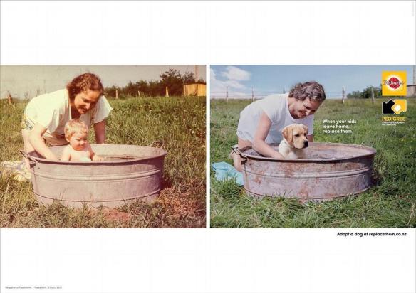
But, the real point is Pedigree and their true commitment to the cause. The cynical might suggest it is a one off PR stunt. Not so. Pedigree really are pet people (dogs to be precise).
I’ve previously posted a brilliant spot featuring slow motion footage of dogs eating treats. It captures everything that the pet owner wants to see in a deliriously happy dog. And it is incredibly shot.
But back to the commitment to the annual Adoption Drive. last year Pedigree launched an eight part online documentary series for Facebook and YouTube to champion this year’s Pedigree Adoption Drive. The fourth year it has partnered with PetRescue.
Few campaigns can even claim a 4 year period of consistency. Yet fewer can claim such creative resourcing of the campaign which is based on the simple insight of pet lovers wanting to help dogs (not just nurture their own).
To place the icing on the cake, the entire effort is branded in the now trade mark yellow and black.
This is one of the best examples of a strong brand leader asserting it’s position in market through exemplary strategy and on-brief execution. The fact that they left the kitchen floor / bowl advertising and championed something new in the category is to their credit.
And here is one of the best pet ads ever made…
I ride a bike and have done for many years. I also drive a car.
I therefore notice the campaigns to keep riders safe – those that encourage car drivers to check the blind-spot etc.
The best was still “think once, think twice, think bike” aimed at car drivers who “didn’t see the bike…” before they turned into it.
This ad is one of the worst kind. It depicts the biker as the only one at fault and yet again ignores the role of the car driver.
As written in the Age yesterday: “But nowhere is there any criticism of the driver who has caused an accident by failing to give way when facing a stop sign. There is not a hint of it. There is, instead, a subtext that it is all the rider’s fault, that since he was speeding, the driver can be exonerated entirely.”
I get that it is aimed at speeding bikers, but for a client that should know better, this ad and depicted situation, will alienate all bikers who understand the constant threat of cars turning into their path.
Amazing lack of insight into the both the problem and target.
If it is speed you want to curb, then show the perils of hitting a corner too quickly, not the perils of avoiding cars turning into you without looking!
Ironic that a SupaCheap auto ad does it better than the TAC: http://youtu.be/z8mOX8PdtOU
You have to applaud an attempt at something different, but for the category the bench mark is the Super Bowl work posted here earlier.
This is the launch of a new model in a fairly conservative sector, from a very established brand.
The question is will this execution reach the target, interest them and motivate them to buy the new Falcon?
Interestingly the “power” message is well conveyed and perhaps everyone does indeed know what the Ford Falcon looks like?
Fun Ford Falcon family entertainment.
I look forward to the Cane Toad Activist’s complaints against the gratuitous violence (surely even Cane Toads must have them?)
Lynx have been successfully using activation stunts to great effect (ref Virtual Fallen Angels posted earlier).
They get the technology and apply it in a way that drives the PR around the brand and builds brand fame. Even after all these years it still breaks new ground with innovative ideas and causes a stir.
This keeps it fresh and relevant to the target and is integrated into the creative in more traditional media work.
Soap were responsible for this and ECD Brad Eldridge said: “We wanted to create something as disruptive and innovative as the product itself. We used a clever hack combining LCD screens and polaroid glasses to create something that extends the campaign in an innovative and unique way.”
Here’s an interesting one.
My initial thoughts were as follows…A send up of “Parkour” runs as a nice piece of entertainment – it does engage you in the story and the inevitable conclusion. The question is does this build brand awareness for Vitek and give you any reason to buy?
Is it really motivating to suggest that the brand is distilled by Peasants and drunk by Royalty? (I keep thinking about hygiene issues). I’m also not sure that the “made in Australia” claim sits well with the brand positioning around Polish distillers?
There is a series of these and we are encouraged to believe that the distillers, whilst expert in making the vodka, are a bit eccentric when it comes to other skills. Presumably through their single minded dedication to the art of making vodka.
If there was some indication as to why we might believe that the Polish peasant brewers are the best distillers it would help.
Perhaps I’m being a bit too literal and critical, but I do feel that the motivation is lacking to buy the brand when there are so many other alternatives.
So given my skepticism, I went on-line to find out more and uncovered a convenient brand truth!
This is an on-line venture and in his own words goes like this:
“My name is Vitek, I was born in Poland, and grew up watching my father not only infusing vodka but also distilling it. So by the time I was a teenager, I knew how to put a bag of potatoes into a bottle.
Regardless of what I was doing professionally I always considered vodka a hobby – until now – suddenly it’s a job and a business.
Like all hobbies you become a bit of an authority on the subject and today I am regarded – in all modesty – as one of Australia’s leading vodka experts.
By applying traditional infusion methods that have been in our family for generations, to a contemporary product, I have created a range of fresh produce vodkas that have received both critical and commercial acclaim. They are Rose, Coffee and Strawberry.
Vitek Vodkas are purposely at 25% A/V because they are designed to be enjoyed for their flavour. They can be drunk with food, as a sipping drink or just hanging out with friends – much like wine. Doing that at 40% A/V, which most vodka is, would get you so trashed you would be losing friends instead of making them.
Like all vodka, Vitek Vodka should be drunk very cold. Put it in a freezer for a couple of hours or in the fridge for several hours before you drink it. Come in, have a look around and get real with the only flavoured vodka that’s made from real ingredients not chemicals.”
I then spotted some magazine articles (Vogue no less!) on Vitek and was left wondering why the ads don’t bring more of this marvelous provenance and product differentiation to life! There is some creative gold in the Rose, Chocolate, Coffee and Strawberry frozen sipping infusions, as the magazine articles point out.
Couple this to a genuinely interesting and innovative website and the product differentiation leaps out at you.
From skeptic to fan in a matter of clicks.
A sin to say it (..to some), but perhaps spending more on the PR campaign will build this into a bigger and better proposition!
New from Droga 5 and continuing the stream of good new Aussie ads.
Good advertising relies to a large degree on insights and truths told through believable stories that are relevant, interesting and motivating. Encouraging people to engage, believe and buy.
This is a great example of engaging with the audience. We might not all be body builders, but we can all see the relevance of this story. Also nice that the brand isn’t sold to us in the first scene – we are invited on a journey that entertains us courtesy of the brand.
I would say it is a future case study in how to tackle “taboos” – this really is classic “problem – solution” advertising in a new and groundbreaking effort for the category. Credit to the team for identifying the specific problem and communicating it!
As always there is a skill in storytelling that is beautifully executed here – Phil doesn’t say anything, the narrative all comes from the VO of his partner. It draws you in and you believe in the characters and believe that it is real – real problems = real solutions. This is so much more effective than trying to create characters and situations that aren’t believable or credible and yet hope to convince the consumer. This is a sector where “efficacy” and belief are critical and this execution delivers in spades…
I’m as interested to see the media strategy to maximize this 2 minutes worth – to be honest, it only takes a couple of views and you not only “get it”, but you remember the brand, demonstrating the power of strong, strategic creative.
And what about this for a “branded” journey we all want to go on… http://flushtracker.com/ (…who said this sector was dull!!??)
Rarely do you come across TV work where you are intrigued enough to really want to watch it through and see who or what it is advertising.
This is one of those rare ads – nicely shot of course and wonderfully cast ( a genuine legend in Bill Baker and a large cast at that…), with a nod perhaps to Fat Boy Slim’s “Weapon of Choice” video featuring Christopher Walken? http://www.youtube.com/watch?feature=player_detailpage&v=ZM1fkHQP_Pw
Welcome to the Jungle – is a nice touch. Relevant to what they are selling and a nice re-imagining of the Guns n Roses original.
Good work from the Monkeys in Sydney
As an interesting post script – debate is raging in the trade press (ref. B&T) following Richard Chees’e claim of plagiarism on the music. The Monkeys have strongly denied this.
Here is his version and his Facebook page is pretty much to the point in terms of his opinion…
http://www.facebook.com/richardcheese: “Wtf. Wtf??????? Wtf!!!!!!!!!!!!!!!!!!!!!!! This is a commercial for some casino in Australia, and they ripped off my “Welcome To The Jungle” arrangement!!!!!!!!!!! You shonky ratbags!!! I’ll tell you right now, this shall not go unpunished. Crikey!!!”
We all know Gorilla, and many love the glass and a half off-beat view of chocolate making. My favourite is still Bubbly with Nena and her luftballoons (as previously posted here)
The Willy Wonker-ish premise is something everyone can relate to and there are glimpses of nicely cast characters, but does it give you the same feeling of satisfaction and surprise as the others?
One of the successes of the other executions was that they prompted a conversation – either “have you seen” or “how did they do that” in the case of glass and a half.
One of the great successes of their campaigns overall is branding – you know from the very first scene that the colour is Cadbury – brilliant job on owning the colour.
However, owning Wonker territory perhaps demands a more “Tim Burton” view of the world.
I feel that Joyville is a cracking premise / idea, but I would have liked an even more quirky execution to leave me wanting to see it again and talk about it. I think that this could develop nicely.
(Disclaimer: I am addicted to the product and love all things Cadbury)
This is a nice fresh addition to the campaign…what I really like is that you can imagine Mrs (or Mr.!) shopper really liking this. A bit of a slap and tickle laugh…much more of the target’s sense of humor and therefore more memorable and motivating.
I hope this develops into more executions and Coles challenger status could be moving into a leadership position in the battle of aisles advertising?
Dawn is receiving a good deal of negative feedback from the industry suggesting that a local star could have done the job? I’m sure that they could, but this is written with Dawn French in mind and she does a great job. I think it adds to the perceived status of Coles to grab a bigger star and one that works so well versus the target.
By their own admission, this isn’t the new strategy, just a tactical ad for own label. It communicates the rational product values well, but I wonder if it could have contributed more to the overall Woolworth’s positioning and emotionally connected better?
Is the humour a bit left field for the target? it definitely interrupts a viewer, but the bigger question is will it engage them and give Woolworths a connection to the consumer?
Did that woman blink in the entire ad? Do the kids seem a bit on edge…?
More to come and eagerly awaited as Droga get the strategy going.
Great work from the Monkeys.
The insight is what kills it for me. love the product and the product doesn’t just do the job on thirst, it’s a full blown chocolate feast of a meal (I do like chocolate…).
Coining “hungry thirsty” is a great way to deliver a message added to which the straightforward, but quirky art direction is innovative and grabs some attention.
Refreshing to see some reality in this sector. I like the all encompassing nature of it and the straight-forward production. To the point, relevant, interesting and motivating many to engage in the charity as well as the brand.
Emotion used in a very motivating way.


