Pedigree continues it’s dominance of consumer insight and creativity.
Image
Reply

Few ads can engage the viewer like this on, I dare you…he’s in there…and you will remember the purpose of the ad. Job done.

An older one, but a good one.
I still recall first seeing this and it making me smile. A little irreverent and beautifully produced.

It seems obvious, but most vegetarians dont want their food associated with meat.
A classic case of not understanding your target market.


As the first Brand Film Festival London approaches, we look at how Phillips, BMW, Intel, and others made pure entertainment with tangible results.
Brand Film Festival London: Five brand films that moved the needle
Last year, Werner Herzog’s Sundance-premiered “Lo and Behold: Reveries of the Connected World,” a documentary that explores the good, bad, and ugly components of the lives we lead on the internet, was met with wide critical acclaim—and a 93 per cent on Rotten Tomatoes.
But one thing many viewers didn’t know, that wasn’t mentioned in its New York Times or New Yorker reviews, was that the film was actually created in partnership with NetScout, an application and network performance management products provider, and produced by ad agency Pereira & O’Dell.
Hardly glorified commercials, brand films are an innovative, growing slice of the advertising ecosystem. And while some have only the subtlest product tie-ins, the best ones very intentionally and successfully meld art with commerce—resulting in increased sales and brand recognition. According to research by Animoto, a whopping 80 per cent of millennials consider a brand’s video content when researching a purchase decision. And they are paying attention to more than just short viral clips.
“I have heard so many times that millennials have a short attention span and that anything over two minutes is a waste of money,” said PJ Pereria, founder of Pereira & O’Dell.
“And that’s kind of right until you think of Netflix. This is also the generation that is binge-watching the longest forms of entertainment ever. They aren’t watching a movie for two hours, they are watching 12 hours straight of a series that they love… We are competing for their time, so we have to make sure every second they spend is worth it. If you are dong some 40 minutes long you have to deliver a highest caliber of content.”
And if a brand delivers 40 minutes of quality entertainment, it can be rewarded with tangible results. Here are five branded films that actually moved the needle:
BMW “The Hire”
Fallon, 2001
When advertisers release brand films online in 2016, it’s par for the course. But when BMW released “The Hire”—a high budget, action-packed, five-part short film series starring Clive Owen and produced by David Fincher—online in 2001, four years before the founding of YouTube, it was revolutionary.
“BMW was a relatively small advertiser in the US car market with less than 2 per cent share of voice. We were being drowned out in TV,” said Mike Buncher, Fallon CEO, via email. “In 1999, research was beginning to show us that affluent car buyers were already using the internet to do their car shopping homework. Most importantly, our client challenged us to shake it up and break the rules. Yes, trading a TV campaign for an internet campaign felt terribly risky for both the agency and our client. One of our founding core values is seeing risk-taking as a friend, and we had taken calculated risks before that paid off handsomely.” Literally.
Following the release of the series, BMW sales increased 12.5 per cent between 2000 and 2001, and then 17 per cent the next year, when BMW released three more chapters of the series. Furthermore, in 2002, according to iMedia, 2 million people registered on the film’s microsite, with 60 per cent opting to receive more information via e-mail, 40,000 opting to take a BMW survey and 94 per cent of registrants recommending the films to others.
“Yes, sales rose, but in reality, BMW sales were already on a steady climb,” said Buncher. “The striking thing was the rise in positive brand impressions, especially among younger drivers. And strong branded content keeps on working long after a TV schedule ends. Eventually there were ninety million film views.”
“The Hire” won many industry awards including the first-ever Titanium Lion, Cannes’ highest honor awarded to a campaign that “causes the industry to stop in its tracks and reconsider the way forward.’’
Philips “Parallel Lines”
DDB London, 2010
Philips’ digital endeavor, created in conjunction with Ridley Scott Associates (RSA) Films, consisted of five short films in five different genres directed by five different filmmakers that had just one unifying constant—the same six lines of dialogue.
“What is that?” “It’s a unicorn.” “Never seen one up close before.” “Beautiful.” “Get away, get away.” “I’m Sorry.”
This unique approach resonated strongly with viewers. According to RSA, within the first week the films were released, Philips received one million film views, 300,000 Google hits, 16,700 website mentions, more than 70,000 Facebook likes, and over 10 million visits to its microsite. Plus, people spent an average of six minutes interacting with the site. According to Mike Hambleton, the digital creative director on the campaign, the format created additional interactivity with the films “that took the viewer out of a given scene to demonstrate key features (e.g. freezing time and zooming in on a bullet shot, that could be manipulated in 3D to show image quality of the new TVs).”
The campaign increased brand awareness and also won industry awards, including Cannes Lion Gold and Grand Prix awards.
Toshiba and Intel “The Beauty Inside”
Pereira O’Dell, 2012
When Toshiba and Intel set out to promote the new Ultrabook, the two brands had a single goal: to appeal to a younger audience. “We knew their relationship with technology was mostly based on two things: entertainment and social media,” said PJ Pereira. “Now that’s a big ‘duh,’ but at that point it was only starting to take shape.”
So they combined both social media and traditional film in the unconventional success “The Beauty Inside,” six-part series about a guy named Alex who wakes up in a different body every day. To mobilise a new demographic of consumers, Toshiba and Intel prompted men and women to audition to play Alex (whose inner monologue was voiced by Topher Grace) by loading pictures and videos via Facebook and other social media. Twenty-six different Alexs were cast from over 4,000 auditions from around the world.
But the film wasn’t only popular with active auditioners. According to Pereira O’Dell, the videos received 70 million views, 96,000 likes on Facebook and 97 per cent approval on YouTube within an 8.5 week period. It also garnered in 378 million brand impressions, a 360 per cent sales lift and a Daytime Emmy.
Perhaps the success was due to the unique role the Ultrabook played in the film. Even though the main character changed every day, one stayed constant: the Ultrabook Alex used to chronicle his daily adventures.
“When you think about advertising now, brands try to make their products the subject of the story. We made the product a character in the story,” said Pereira. “And guess what, if you look at Hollywood’s greatest movies, what you remember are the characters not the story. We remember Forrest Gump and Bubba, but we can don’t really remember what the story was about.”
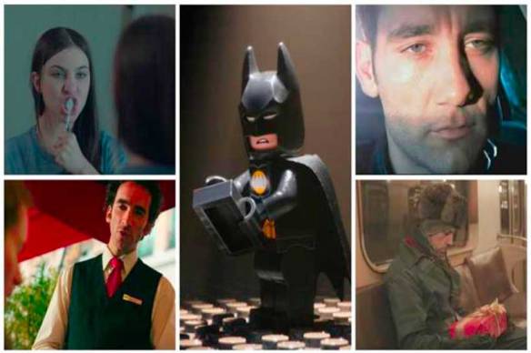
“The Lego Movie”
Warner Brothers, 2014
“The Lego Movie” set the gold (brick) standard for toy-inspired films. (Sorry, GI Joe.)
“Right from the start, we were skeptical about doing it because people could see it as a giant commercial and that wasn’t something we were interested in doing,” the Lego Movie co-writer and co-director Chris Miller told Fast Company. “Luckily, the people at Lego felt the same way. They didn’t need a movie to boost sales.”
But that doesn’t mean that it didn’t boost sales. Not only did viewers pay $200m (£162m) at the box office to see 100 minutes of Legos, but the company reported a 15 per cent global sales growth in 2014, largely attributed to the success of “The Lego Movie” products. And sales continued increasing in 2015, which Lego Chief Executive Jørgen Vig Knudstorp declared its “best year ever,” with a 25 per cent revenue growth. (Although many factors led to 2015’s numbers, Fortune indicated that the sales boost from the movie was a significant factor.)
Marriott “French Kiss”
Marriott Content Studio, 2015
“French Kiss” is a short film about an international business traveler who learns to look beyond his laptop to experience the beauty and adventure of Paris. But in addition to a charming story, the movie offered what David Beebe, vice president of creative & content at Marriott International, described as the company’s “3Cs of content marketing” strategy: “producing engaging content that builds communities that drive commerce.”
According to Beebe, not only was the film watched more than 6 million times on YouTube, but more than 80 per cent of viewers sat through the 24-minute film in its entirety. On top of that, Beebe noted that the film also “put heads in beds,” creating revenue for the hotel in which it was shot — a hotel that became a character, of sorts, in the film. The “French Kiss” package ended up generating $500,000 (£406,000) in sales in just 60 days.
“The idea was that you as a viewer would be able to experience the same things you’re watching online,” said Beebe. “We created a sales package that included a meet and greet with the GM, a special rate, champagne and chocolates on arrival, a dinner at the hotel and a private VIP tour at all the sites we shot at, which of course included iconic sites people want to see when visiting Paris.”

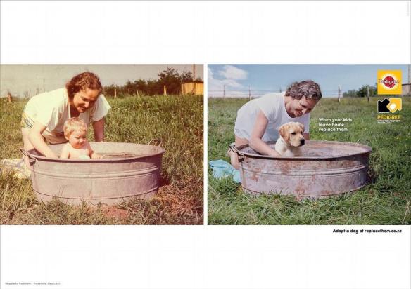
Rarely do you see a campaign that is creative and consistent. It isn’t changed at the whim of a new agency or new brand team, it perseveres with a good creative idea, well executed and above all brilliantly branded.
The colour way, the art direction, even the logo all show clear adherence to the original expression.
I love it. Even without a Dog.


Lego and Chevrolet have joined forces to promote the February 10 release of “The Lego Batman Movie”. The Batman logo spotlight dawned on a downtown Detroit skyscraper the evening before Chevrolet revealed its 17-foot Lego Batmobile at the first public day of the North American International Auto Show.
Chevrolet, in conjunction with Detroit’s Cody Rouge community, A World in Motion, and First Lego League, unveiled the 1,695-pound life-sized Lego Batmobile that took 1,833 hours to build and consists of 344,187 Lego bricks. Inspired by the Batman’s Speedwagon in the upcoming movie, the Lego structure is almost seven feet high, over nine feet wide, uses 17 colors, and is supported by an interior frame made from more than 86 feet of square tube aluminum.
According to U.S. president of Chevrolet Marketing, Paul Edwards, “To work on the LEGO Batmobile with Warner Bros. is an absolute thrill for us at Chevy.” “Many of the themes in ‘The LEGO Batman Movie,’ like imagination, family and community, align perfectly with our Chevy brand values and add to the value of the partnership.”
Posted previously, but I’m compelled to bring it back to the top of the pile for another outing.
LEGO has certainly become an incredibly flexible brand without losing it’s core promise of creativity and imagination – as brilliantly established in its classic 1981 Mike Cozens “Kipper” ad, still one of the best ads ever made, particularly as I remember seeing it is a young LEGO fan…(interestingly the impressionist Roger Kitter not Tommy Cooper does the voiceover):

A car buff might spot an autonomous Volvo XC90 at the roadside. The discreet sensors and cameras will give away that it is one of a fleet of 100 of the SUVs that Volvo customers in Gothenburg, the carmaker’s home town, will be allocated in 2017 in a trial to gauge how people take to autonomous motoring. Anyone will be able to identify the car in action. As cars piloted by humans whizz past on one of the highways in the city designated for the experiment, the Volvo will draw attention by sticking doggedly to the speed limit. But the Swede in the driving seat, freed to check e-mails or look over her shoulder to keep children in check, may not care that the journey takes a few minutes longer.
Volvo plans to run similar-sized fleets in London and several Chinese cities too. Although carmakers and tech firms, such as Google, have been testing self-driving cars on public roads for some time, no members of the public have yet been handed the keys to one. But Volvo is keen to see how ordinary motorists react to autonomous driving and the problems they face, such as how to take back control when the autonomous-driving phase of a journey ends.
Those hoping to set their destination into the navigation system and slumber as the Volvo takes the strain are out of luck. The XC90s will operate autonomously—slowing down, speeding up and changing lanes where necessary—on only a few designated stretches of four-lane highways around Gothenburg. Human intervention will be required for the rest of the journey. And if the car runs into difficulties in autonomous mode (say, roadworks appear which the car cannot negotiate), the driver will need to resume control.
This hand-back is tricky. A driver immersed in another activity may need plenty of notice to assume safe control of 2 tonnes of speeding metal. In that sense, the system is scarcely an advance from driver aids that are already available on many luxury cars and are also capable of braking and accelerating independently. Those, however, require drivers to keep hold of the wheel and fix their eyes on the road constantly.
This problem explains a growing interest in “robotaxis”, cars or pods without a steering wheel or pedals, which can make entire journeys on crowded city roads that are complex to navigate. Removing the expensive human component gives these vehicles a clear business case. Ford says that it will develop a mass-market version by 2021. Uber, a ride-hailing giant, is testing a service in Pittsburgh using Ford saloons and adding its own software. Singapore is setting aside a small part of the city for robotaxis based on adapted Renaults and Mitsubishis. GM, in cahoots with Lyft, another ride-hailing firm, has similar plans. Tech firms and carmakers alike are working hard on autonomous cars for business and pleasure, and most hope to have something to show for it in around five years.
So the race is on, but roadblocks abound. Every week a new glitch seems to crop up. Swedish law, for example, requires cars to stop if a roadside policeman holds up a hand; Volvo’s sensors and software can recognise the hand but not if it belongs to a cop or a carjacker. Junctions are tricky at the best of times, but more so when each country has a slightly different traffic-light system. And it is unclear whether a burst of acceleration that breaks the speed limit but gets a driverless car out of danger will be permitted. Having to stick to the speed limit is just one of the brakes on driverless cars.


A great visual tree treat

Simply innovative.

A brilliant product demonstration (…as many good ads are). I just hope a security guard was close at hand.
PR stunt perhaps? But more seriously, a poor and very amateur attempt at advertising. Many comments in social media hark back to a more ‘open’ time in 1970 something. Exactly. And the charity sign-off doesn’t excuse the execution.
Believe it or not, urban Philadelphia is home to a number of horsemen. The city has a large park system and 200 miles of trails, and in the ’80s, there were hundreds of cowboys out around town. Hackney, London four-piece Rudimental’s new video was filmed on Fletcher Street, whose riding community was profiled on This American Life‘s short-lived TV show. Horses have boarded on the residential stretch since WWII, but riders have struggled in the last few years, clashing with state agents who called conditions at the stables there “atrocious.” In spite of this, Fletcher Street still welcomes whoever shows up, giving kids a chance to ride, learn to take care of an animal and call it their own. With an organ, “Feel The Love” starts gentle but quickly goes full-gallop: bass hurling itself around like clothes in a dryer, a yowled trumpet melody. Below stream “Spoons,” another Rudimental track released in February.
Here is a really nice succinct creative idea.
You get it. In 16 seconds or less.
I was a fan and then I looked into what you were getting. In essence the text service is just an intermediary to a Google search via the call centre. And it costs to use the service?
Given that 52% of Australians over 16 years of age have an internet enabled smartphone, the service starts to look less appealing and is arguably a premium time saver at best.
An excellent, low cost creative idea, campaign and execution, but perhaps a questionable product benefit.
The original was a corker, the follow up fishing fellow wasn’t so good.
So we now have a new mega ad – The epic 90 second version of Into the Woods went live on Facebook and YouTube, on October 5th. Stage two is the 30-second pre-launch teaser on prime time TV, October 7th, and 8th, supported by movie listings advertising across News Limited publications. Campaign climax happens mid-October when the 60, 45 and 30-second films go to air on television and cinema screens across Australia.
So all that said and done, is it any good?
I think it lacks the creative impact of the original. This had a cracking creative idea, based around a product truth and packaged up beautifully with a clever bit of humour:
The new version seems to take the premise of “enduring the best” (which was most likely a reverse engineered / post rationalised proposition) and stretched it a bit too far.
More of a story than an ad based on a product truth and a continuation of the creative campaign.
Campaigns are precious things that need to have clear direction and it seems that John West might have lost their mojo in chasing the salmon in this one.
Despite all that, the idea of enduring the worst to bring you the best is solid. A John West Facebook page provides an interactive platform where consumers are encouraged to be their best by sharing their achievements and getting a taste of the epic adventures of others.
But as always, the adventures that John West presents in ads have to remain as relevant, motivating and interesting as possible. Having created some great work, they have a tough job to beat it.

The Billund Brick is back with more for the 50th anniversary celebrations in Australia.
A set of very nice top 10 moments, which were voted for by the public, have now been immortalised in Lego bricks.
British photographer Mike Stimpson has built the Lego scenes and they are now on display on the Lego Festival website, which is marking the 50th anniversary of Lego’s arrival in Australia.
“Creating historical moments with Lego Minifigures is a great passion of mine, and I’ve had a lot of fun taking these moments that Aussies hold so dear to them and turning them into fun and playful Lego Minifigure versions,” said Stimpson.
The top 10 moments are (see the images here):
I’ve posted previously on the power of the game franchises. Here’s a corker from Brothers & Sisters in London – as they say:
We’ve made a proper scary advert. 20 watches and it’s still chilling the bones
Few can compete with Resident Evil.
The movies and games are guaranteed to sell by virtue of the strength and quality of the franchise.
Most studios would bite off their right arm for this sort of selling power.
As we near the release of Resident Evil 6, this quietly terrifying trailer is hitting cinema screens (not to mention the viral overload).
It is brilliant in it’s understated and chilling simplicity and in the way it portrays the point we have reached in the story.
Production values are top class, but like any horror genre, it’s what you don’t see that scares you senseless…and it also looks like the game.
Here’s what they say in the pre-order blurb:
Resident Evil 6 is the dramatic and horrific fear inducing blockbuster entertainment experience of 2012, delivered by The Godfather of Survival Horror.
• 4 closely interwoven scenarios each with their own protagonists and challenges, come together in Resident Evil to reveal the truth about a global bio terrorist attack
• Experience the horror of Resident Evil 6 from three different perspectives. Feel the intense fear as Leon investigates the President’s murder; the horrific action as Chris fights in China and the tension as Jake escapes from Eastern Europe.
• Team up and share the horror of Resident Evil 6 with online co-op action for up to 4 players
• Face unpredictable enemies in Resident Evil 6. Zombies that run, jump and wield weapons plus the deadly J’avo that, when hit mutate into any number of hideous forms.
• Check online stats, progression and compare to friends on the free residentevil.net service
‘Like’ on Facebook
http://www.facebook.com/residentevil
Follow on Twitter
http://twitter.com/#!/RE_games
It is all too rare to see an arresting ad that has this sort of impact with a precisely targeted group.
If you didn’t know what was coming (as most viewers don’t on Nickie’s site), the impact is phenomenal.
The genius in this ad is to get the creative idea beautifully executed and placed in the most relevant, well targeted place possible – Nickie de Jagger’s YouTube site.
This is VW creating a relevant and motivating connection with drivers.
VW are one of the most impressive companies at this sort of big idea based advertising. A few classic examples:
VW deepest bin and VW Stairs from their fun theory creative site.
The video can originally be found in Nickie’s channel Nickie Tutorials
Thanks to Gruen for getting this one on-air.
To be more precise…2012 Yeosu EXPO HYUNDAI MOTOR GROUP – Hyper-Matrix.
The Hyper-Matrix is comprised of a steel scaffolding and thousands of lightweight, 300mm x 300mm cubes, each attached to its own stepper motor.

Lots of future possibilities with this one.
More good work from the Bonds pants people.
The same campaign, with a touch more attitude.
I’ve posted a succession of great Bonds work.
It is one of the best examples of campaign consistency. Sexy, fun ads for the target that are really great product demonstrations. Relevant, interesting and motivating from an emotional and rational point of view.

All with well crafted soundtracks (particularly the Baby “Zip It” work). And great product names / descriptors. Simple, but effective.
I hope with the changes at the company they stick to the plan – all too often the need for change in a campaign can be client rather than consumer.
Bonds remain a cool and clever brand.
Some other examples: blokes, babies, hipsters, rollers, others…
Clemenger BBDO Melbourne have made a new blokes beer ad. It’s good to see a big ad for a big Aussie brand taking centre stage again.
Enviable ad budgets, blokes, beer, it’s all there, but there is a nice quirky ’80’s movie parody idea behind it that supports Carlton Draught‘s ‘Made From Beer’ positioning. We expect a lot from big brand beer ads and this one delivers.
The ad takes you on an entertaining story and is played out with some nice touches with a good deal of mirth.
If Carlton want to be a bit blokey, young, fun and trendy, then this should work wonders.
A nice touch was the fact it was distributed to the AFL database before it is aired in the ‘footy’ finals on Friday night.
Advertising Agency: Clemenger BBDO, Melbourne, Australia
ECD: Ant Keogh
Art Director: Ant Phillips
Copywriter: Richard Williams
Managing Partner: Paul McMillan
Director: Steve Ayson
Managing Director: Andy Traines
Producer: Cindy Kavanagh
Head of Production: Renee Robson
Production Supervisor: Gus Kousoulas
Editing: The Butchery

I like this effort from Clemenger BBDO Melbourne for NAB.
It fits with their ‘different’ positioning and actually has a point in terms of the product offering to ‘free’ people from locked in contracts.
Even though it didn’t come off, nice bit of social media work.
Not so convinced of the rationale behind NAB putting a $20,000 reward to the first housemate who chooses to leave the Big Brother house. Surely this could be better spent?
And Big Brother should expect more remote control planes, fly-bys, kites, sign writing and any other form of intrusive, interruptive brand work. Nine were not amused, but isn’t there an advertising opportunity in there somewhere?
Tourism Australia and Qantas have rejigged Icehouse singer Iva Davies Great Southern Land track.
The aim is to sell Australia to tourists.
The first thing that surprises me is that this is more music video than tourist ad?
The second thing is that It will run online only, including Twitter and TA’s Facebook page.
And this is on the back of DDB’s most recent incarnation of the There’s Nothing Like Australia campaign, which cost $4m to produce.
I’m not convinced that a song which means more to Australians than any other nation, sung by artists mainly recognizable only by Australians will attract a flood of foreigners?
And no surfing on golden beaches?
This will have to work very hard via social media if it is to attract the traveler in the face of a strengthening Aussie dollar and I can’t help thinking it is another montage of nice shots and song rather than a strategic advertising effort.
An Australian version of this ad drew complaints post a recent spate of shark attacks.
The ASB on giving it the all clear noted consumers’ could interpret the ad as distrespectul given the recent shark attacks, but ruled it didn’t breach Section 2 of the Advertiser Code of Ethics and was in line with health and safety community standards.
The Bureau argued: “Catching or riding a shark is completely unrealistic and most of the community would see this as being fabricated for the purposes of selling the product”.
The brand, owned by Pepsico Australia Holdings, responded: “This commercial was not intended to be insensitive to those who may have suffered in shark attacks. The tone of the advertisment is humorous […] and clearly ‘over the top’ and not intended to replicate in way any real life experience.”
I think an interesting point is the depiction of the shark. Mountain Dew show the shark in full Jaws mode i.e. scary.
A similar effort from Arena takes a different and more relevant approach and is probably better for it. Sharks and any depiction of potential killer instinct at work is tricky at the best of times, let alone when the sharks are attacking swimmers.
This ad is getting a lot of discussion going outside of its exclusive airing in Japan.
The ad features 19-year-old Stav Strashko, who identifies as transgender. The tagline for the campaign is, “not in trend, not casual, not for everyone, not authority, but Auris”
One lesson in advertising (particularly car ads) is make the product / car the star.
This ad is both awkward for its use of a niche personality to sell a mass market product and also fails on presenting anything about the product – I don’t buy the ‘hybrid’ body / car analogy.
It gets attention, but for all the wrong reasons and does little to sell the product. Not relevant, interesting or motivating for the category or target and gratuitous in its use of talent.
![]()
This is a funny ad, particularly for all the parents out there.
But it also continues in the IKEA tradition of delivering the simple proposition of low prices and decent quality (value).
It is a rare example of an arresting bit of creative that gets your attention and ensures that you remember the advertising message.
Nice work by The Monkeys.
There is some great outdoor advertising in the UK from Channel 4 that features the line “thanks for the warm-up” in reference to their broadcast of the paralympic games in London.
Australia’s satirical show on all things advertising The Gruen Sweat featured this promo (not ad., but in-house produced promo).
This is one of the best examples of selling a product and subject that isn’t instantly in demand from the general public. As well as agency quality production, the genius is in the creative idea that includes the depiction of accidents that led to injury and disability.
The message is that this could be you.
It is a powerfully produced piece of work and a good effort to get our attention and awareness of Channel 4’s broadcast, whether it will drive actual viewership is another question, but given the momentum of the Olympics this is giving the games the best chance of some serious viewing.
This also proves a point I have long believed in. In-house production teams, who know their brand and content, can do a great job to sell it to their viewers at a fraction of the cost of agencies.
A nice taster here:

Channel 4 says the campaign is the biggest it has run since the station launched in 1982.
The advert was directed by Tom Tagholm for Channel 4’s in-house agency 4Creative. Tagholm said:
“We knew we had to make some noise. We knew we had to add some edge and grit and attitude.
“We narrowed it down to four or five concepts but then someone came up with this line: ‘Meet The Superhumans’. We loved the scale and the confidence of it. So we built up from there to create the strongest, most impactful concept we could get.”

The Channel 4 blog puts it like this:
“As for the scenes in the middle with the explosion and car crash and the mother in the hospital – we thought long and hard about how to include them because one thing that we weren’t interested at all in doing was an advert which said ‘Isn’t it great that these guys have made it to the start line?’ That just didn’t interest me and I don’t think it interested the channel.
“What I wanted to do though was just get a flashback moment – to show that it’s a part of what they are now and a part of their physicality. I didn’t want to dwell on it, just to give a hint, a moment of just how tough these characters have had to be. I could have put those scenes at the beginning or the end of the trailer but I think it’d have been weirdly less impactful that way – having them where they are stops you right in your tracks and hits you in the face.”
And the Public Image soundtrack nails it.
It was bound to happen given the earnest nature of the initial Toni Collette effort.
A bit cheeky, but fun for a tactical moment.
The bank is now investigating whether the parody breaches its intellectual property rights. You would not want to get into a legal battle with these billionaire bankers.
Clearly Commbank spotted this parody very quickly, unlike it’s appalling and “unapproved” Backpack Bomb hoax ad that aired on-line for the Olympics.
The parody has now been removed courtesy of Commbank.
I’ve long been a fan of Bonds work.
The ads are all well branded – the style is itself a brand attribute with good music and lots of model movement in a signature Bonds fun fashion (roller-skating being a good example).
Bonds are featuring the Comfy Tops and Hipster No Shows for women and the No Rides for men.
The campaign, called Versus, pits the new shapes against one another and tells the consumer to “Shop Your Shape”.
It is clear, simple and direct as well as very well produced for the target. Essentially a great product demonstration which is at the heart of many good ads. Boys want to be these guys and girls want to be with these guys.
A similar approach to the ads featuring girls
I get the “no rides” classic Hipsters (as featured in their girl band ad with attitude) and “comfy tops”.
My only question is the “quick dry” range for men…?
Either way more good work from Bonds following in the footsteps of their last baby ad – Zip It. with Devo.
![]()
We all know about the restrictions over the use of Olympics footage by broadcasters who don’t have rights.
The still images of Olympic glory just don’t do it by the second Olympic week and therefore a few media outlests including ABC News, The Wall Street Journal and The Guardian have turned to Lego.
I’m a Billund Brick fan since the age of 4. Few brands stick with you for this long and can re-invent themselves and remain relevant and truly interesting to the older and newer generations. A Lego VW Combi van did it for me, not to mention the promise of a Lego action movie no less.
You’ve got to love the fact that the professionals turn to the humble brick with some amateur athletic endeavors when all else fails.
Here are some of the best bits of brick from Legos 80th Anniversary year:
Lego Australian 50th Anniversary

I’m a big fan of the Billund bricks as a few previous posts show.
Their 80th anniversary year is proving to be a significant milestone in product and promotion.
Here is a lengthy but completely engaging animated video telling the Lego story in a memorable and motivating way.
It describes the life of Ole Kirk Christiansen, who created the company in 1932 with his son Godtfred, Lego’s second owner, all narrated from the perspective of the founder’s grandson and current owner Kjeld.
The video delightfully describes the trials and tribulations of the company and how they came up with the name Lego from the Danish “leg godt” which means “play well” as well as “I put together” in Latin.
It’s great to see a brand really proud of it’s provenance and confident enough to produce something like this.
Here is a truly iconic brand that has consistently been in shopping baskets since first sold in Fortnum & Mason in 1901.
Most of us still associate it with the famous 1967 “Beanz Meanz Heinz” slogan created by advertising executive Maurice Drake.
In other words it is a true perennial that is still in most households.
I love this ad because it shows some proper insight on the shopper. It relies on the fact that most of us have a can, but many of us have lapsed with our usage if not love of the beleaguered bean.
The message immediately resonates with the viewer. It reminds us of a neglected friend hidden away that deserves better!
Tom Ward, head of strategy and insights at GPY&R, said:
“The problem is that all too often that is where they stay, to the point that people will sometimes end up with two or three cans tucked away.”
This sort of genuine shopper insight is great to see. Hopefully the campaign will grow as we see how people have rekindled their love affair and bust out the beautiful bean…
Kimberley Clark are going out of their way to push the problem.
It might be “leakage” or it could be the risk of attracting dogs by virtue of an unclean bum (ref Kleenex Cottonelle).
This latest effort is confronting women with what we are told is a common problem. The solution is U by Kotex.
In both cases the company tackles the problem with clear product solutions.
Both approaches and that of Carefree raise an interesting question. Do consumers respond better to direct, descriptive advertising and what level of directness is more effective? The word “vagina” has recently been a subject of many complaints regarding the advertising campaign for Carefree Actifresh.
It’s interesting to ask if this approach researches well with all women / consumers? The industry likes to trumpet from on high and say we MUST change the consumer – “better out than in!” and remove ourselves from these suppressed notions of discrete advertising…? A vocal minority applaud the use of language that can make mums and dads cringe into their sofa. “It’s a vaginal discharge so lets herald it from on high!”. I’m not so sure.
There is a subtle balance between being direct and being overtly confronting to women and families in their own living rooms. U, which is firmly youth targeted, gets it right. We aren’t shocked into awareness of the problem and efficacy of the solution, we don’t hear language that is too confronting and we are indirectly very aware of the problem without being told that it is a “vaginal discharge”…territory other brands would prefer to own.
At the end of the day it is about understanding the audience not just the user and when it is the mass medium of TV the family audience matters. This is why it is an interesting topic for discussion when used in mass market media (rather than more directly targeted communication).
Without being overly conservative I sincerely hope that brands don’t continue to reach for stand-out notoriety by the use of the lowest creative common denominators in overtly describing what many real people consider to be discrete categories.
The true creative challenge is to communicate the problem and benefit / solution without the reliance on the literal descriptions and language.

Oreo has become cool.
A diminutive biscuit (cookie…) that hasn’t changed much about it’s appearance in 100 years is re-inventing itself.
More than that, it is reformulating its advertising as well as it’s ingredients.
This ad does a nice job of making Oreo a bit more topical courtesy of the Mars Rover landing on the red planet.
The Curiosity Oreo is not available in stores which is a bit of a blip in the strategy. Even as a PR giveaway it would have been outstanding.
The red cookie follows in the footsteps of a previous space-themed, boot-printed cookie in honor of the July 20th anniversary of Neil Armstrong’s inaugural walk on the surface of the moon. And it is part of a much longer Daily Twist campaign.
A rainbow cream stacked Gay Pride-themed Oreo drew over 65,500 comments (both supportive and opposing) on the company’s Facebook page and was shared nearly 300,000 times.
Nicely understated and gaining popularity on-line!
The ad, created by DDB Sydney, features Men At Work’s Colin Hay and a cast of Ozzies in London. An unbranded version of the ad was played to the whole Olympic team just after Australia’s flag bearer was announced. This immediately shows that it is hitting the right note with real people.
I like it for its honest simplicity and emotional effectiveness, versus other efforts to convince us of Ozzie roots / provenance or general “Ozzieness”. This spot seems to strike the right “C’mon Ozzie” chord with the locals versus metaphorical skyward gazing from Qantas or too much deep and meaningful from CommBank with Toni Collette.
A few people have referenced this ad in preference to the Qantas effort and I can understand why. Both use music to bring you the brand, but Telstra hit a better note with the locals.
And we might even assume that it is relevant as these Ozzies will all be phoning home!?
A good tune with the right emotional pull can make even a modest ad, with few rational reasons to believe, a memorable and magical effort. At the end of the day and as Hegarty once said:
“If you can’t say it, sing it…”
Please note – I wouldn’t look at this if you’ve got food on your mind! It contains explicit zit popping material.
A while ago an almost surgical excising of a zit became an internet viral hit – the on-line pimple squeezing got a lot of views. 5 million endured the 3 minutes in full glory.
Some of those unforgettable moments are in this piece from Naked Comms in Sydney together with a multitude of other zit popping moments.
The venerable Adam Ferrier said:
“We pride ourselves on finding the right solution to the presenting problem. This video, although difficult to watch for some, will tickle the target markets interest and get people to try Oxy.
“The idea came from the simple insight that guys like watching videos of guys squeezing big pimples. It speaks to our target much more authentically than the glossy, cheesy work of Oxy’s big spending competitors. We believe this work will result in mass trial of the brand, and change consumer behaviour towards Oxy.”
An age ago I worked on the brand when it was with SmithKlineBeecham. We thought ourselves somewhat revolutionary for introducing the word “zit” into our ads – famously coining the line “Blitz those Zits with Oxy”. It did well as it appealed to the target in their terms versus Clearasil which was still talking “cleansing”.
That was prior to the connected revolution the target enjoy today so I think it is probably a very smart strategy to re-calibrate the conversation (on-line at least) and show the true gory glory to the target.
The on-line piece concludes on a free sample afer the “man sized” message – it works and should generate trial if it reaches enough people. My only add-on would have been something a bit more brand centric about to close…something like:
“Blitz those Zits with Oxy…”
I liked the last set of ads P&G released for the brand. They were in keeping with the “Smell like a Man” theme of previous work and had the same nicely edited touch.
But this work is a head scratcher?
The same tune is applied to what I think is quite a different idea and I’m left wondering if this is stretching the original creative premise too far just to shoe horn in the Olympics reference? It doesn’t really work as part of the previous idea or as a stand alone.
Particularly after P&G did such an original and classy job with Olympic mums?
Perhaps this is a case of “Too much of a good thing” regarding Smell Like A Man theming, and P&G need to find a more original way to build on their classic work if the brand is going to continue to re-establish itself.
![]()
After much anticipation the new Qantas campaign has launched.
The ad features the new tagline “You’re the reason we fly” with a Daniel Johns track, titled “Atlas”. Somewhat put in the shade by the latest Telstra “Land Down Under” track. The ad also has a new logo, a compilation of 22,000 Australian faces which make up the flying kangaroo.
It’s interesting that the campaign has dropped the famous song “I still call Australia Home” and has also moved away from iconic Australian images.
Featuring real people is a “see-through” strategy to ensure that “real” people feel that this is their airline (and that’s the reason they fly…). It hopes to be relevant to them and that they will relate to it. As an iconic national carrier, that has arguably lost it’s way, this is quite a risk. The notional change from “Australia’s” to “Australian‘s” airline indicated that this was coming.
The question is what does the ad do to either inspire people afresh or change attitudes? And there is a bit of a negative mountain to climb in many travelers minds both perceived (press negativity) and experienced (the entertainment isn’t working, it’s late again etc)
Emotionally it engages through the everyday people it hopes to be relevant to. Some nice shots and as you would expect beautifully produced. The launch campaign is customer-focused, featuring Australian’s from the coast, the cities and the country, a destination-based TVC will follow.
Unfortunately the depiction of everyday people is somewhat generic. The “reasons to believe” or think differently about the carrier are absent.
I believe advertising must have a creative message that sells (really!). I’m not sure what I am asked to buy in this ad or what attitude I am expected to change? In other words it is generic.
The previous ad famously became an anthem for all that was great about Australia (and delivered by Qantas).
This seems to lack any proprietary backbone in terms of what is unique about Qantas. Owning the place was one thing that resonated as it is a national carrier going to all parts of the country (less true these days). Owning the people is quite a different proposition that relies on delivering superb service which judging from on-line comments is somewhat lacking of late.
In comparison to the Virgin ad which stressed a fast pace and determined approach to service (…showing staff, service and boasting a lot of planes no less!), this ad falls short on delivering a message that you can grab hold of and believe in. At this stage in the brand journey, people need a bit more substance to believe in.
The compilation logo treatment has a lot more style than substance and is perhaps too wrapped up in the strategy of “Australian’s” versus a clear depiction of the logo, particularly when there are no other clear brand references in the ad – I believe that you can never assume that everyone seeing it knows who it is for.
I completely get where the ad is trying to position the brand, I’m just not sure it is as convincing as it needs to be.
As a recent article put it the new generation of traveller has no emotional attachment to Qantas and its wider significance to the country, also suggesting that:
Qantas is coming home to an empty house, with a sign pinned to the fridge saying, “Your chicken dinner – or beef dinner if we cannot fulfil your first choice – is in the dog” and an ever-growing stack of bills to pay.
A lot of work to be done to change hearts and minds.
Qantas has said that the TVCs are designed to tug on the “heart strings” and to “re-engage emotionally with consumers”.
The final stage of the campaign, which Qantas has labelled the ‘prove’ segment, will make up the lions-share of the rebrand efforts.
Is this another example of the consumer being gently introduced into the sell via a soft emotionally charged entrée? It seems to be a trend amongst bigger budget brands to “engage” emotionally first then sell second with proof points (Commonwealth Bank, Virgin Mobile, Woolworth’s etc).
The cynical might suggest this could be a clever sales tactic by agencies. But I think it is flawed to assume that consumers are interested enough to stay with brands through these different phases (and connect them). The better option is surely to make a single ad (or connected campaign) which can receive significant weight and generate the desired impact emotionally AND rationally (Hyundai, Cannon, The Guardian etc)
The team at Qantas are skilled marketeers with broad budgets and I hope that the rational reasons to fly with them (the proof) will be delivered in the next ad against this emotionally staged backdrop of relating to everyday people.
The problem with this execution is a basic one – marketing 101 really:
“what is actually proprietary and unique about this ad”?
The answer is very little. Added to which, the ‘You’re The Reason We Fly‘ tagline is exactly the same wording used by the now-defunct Carnival Airlines in the USA.
As reported in AdNews, creative leaders have not suggested Qantas plagiarised the positioning, they have chastised the company for using a “generic” statement that could have been used before, and for “not doing their homework”.
McCann executive creative director John Mescall told AdNews: “It’s not surprising this has happened because it is such a generic motherhood statement. This is laziness not plagiarism.
A lazy, generic approach to advertising and the assumption that consumers will be interested enough in the emotional “art” to act or change opinions, shows a lack of insight into the consumer, the category and a lack of belief in the brand’s selling points (which are absent).
Ultimately everyday people will judge this work versus the previous iconic work and more importantly, they will judge the airline by the delivery of a decent service in a highly competitive market.
Unfortunately, I think that this work will fly by them relatively unnoticed.
Much of my recent postings have been around the subject of “taste”.
This is taste in terms of what advertising should and shouldn’t say and suggest around traditionally taboo subjects. As well as examples of poor taste propped up by the excuse of irreverence and tongue in cheek (Lynx being a shocker)
Some would argue that taste is a subjective measure of what we as individuals deem appropriate as advertising.
I think that the question of taste or advertising standards is more than that. We need to arbitrate in these matters on behalf of the mass market majority who are exposed to the advertising – particularly when it is on TV. Rather than crushing creativity, this should actually prompt more ingenious, imaginative solutions to communication.
The creative community can argue that we should break these taboos – use the word vagina when discussing feminine hygiene. Show explicit imagery to demonstrate problems (accidents / disease etc). Many might suggest that we are lessening the creative impact by embargoing these words and images.
At the risk of sounding conservative on creativity, I don’t agree.
I think that this ad is a beautifully produced ad. It captures the attention and the dialogue is relevant and motivating to the target. The last thing it needed was the seemingly gratuitous inclusion of the word vagina. I don’t think this inclusion adds anything to comprehension or awareness of the message. It just shocks the casual viewer, as in “did they just say that”?
Are we to imagine that the target didn’t get the message and needed to be alerted to it through hearing vagina in the monologue?
In the words of Johnson & Johnson:
“We have decided to take a bold approach in this campaign with the aim to tackle a subject which has always been taboo.”
I don’t think the language is going to make this a bold ad on a taboo subject.
There is a lot of debate on it at present. Daye Moffitt, brand strategy director at creative agency Moon, offered a female perspective.
“Personally, it makes me cringe, but that’s not necessarily a bad thing and I do think it is a good strategy. The shock tactic helps with getting young women to listen up – it gets their attention in a very loud marketplace. It’s an effective and memorable ad, certainly.”
With the greatest respect to Daye, I think that cringe is the issue – imagine how parents with teenage boys respond when they hear it.
As anticipated the Australian Advertising Standards Bureau has received over 30 complaints since the ad first screened on Sunday evening. A spokesperson for the ASB said:
“Most of the complaints are about the terminology that’s used and the nakedness of the woman,”
Interesting that the nudity got so much attention, suggesting how conservative our viewers really are.
The creative challenge reaches beyond the use of explicit or provocative language. And “vagina” can be considered as explicit language to many in the mass market living rooms.
Creativity needs to find new ways of reaching into the consciousness of viewers. Ways that don’t rely on gimmicks, tricks and controversy.
The ad is good, not great, and the inclusion of the word vagina merely serves to draw attention to the word not the problem or brand. Probably at the cringing discomfort of many women who would rather not shout it loud and proud from the living room floor.
These women are after all the target market and discretion in communication is perhaps more relevant and motivating than the vagina monologue.
Sometimes the understated brilliance of a good creative idea speaks volumes.
A great, relatively low cost attention grabber…

![]()
Every bit of me says I should lambast this work.
Here we have the legends (Grandfathers…) of Rock, the mighty Status Quo, reworking their 1975 hit, ‘Down, deeper and down’, to include Coles’ ‘Down, down, prices are down’.
Quo’s original track was the inspiration behind the supermarket’s grating, but memorable tune introduced last year.
But before I drift off into dismissive hyperbole about the demise of the once great ad industry, a few salient thoughts:
The overall impression isn’t therefore that this is a credible Rock band selling out, it’s more a case of here are some ageing Rockers having a laugh at the expense of Coles.
At the same time it delivers the message and as a nod to the original tune is a bit of fun (if a bit of a cringe at the same time). This should appeal to a lot of the mass market and get the tune lazer etched into everyone’s subconscious.
Red guitars on sale in-store apparently.
Funny for a moment, but I only hope we don’t have to endure the joke too often on our screens!
Here are the boys doing their bit:

Just a great piece of work that shouts great insight. It draws you into the message.
Love the series.

“Choose Later – Up to 130 consecutive shots.”
Advertising Agency: Giovanni+DraftFCB, Sao Paulo, Brazil
Chief Creative Officer: Javier Campopiano
Executive Creative Directors: Benjamin Yung Jr., Cassio Zanatta
Copywriter / Art Director: Adriano Alarcon
Photographer: Zarella Neto
We now firmly understand that a labrador puppy is the spokes-dog for toilet paper.
Usually he sprukes soft, strong and very, very long. And because he is soft and cuddly, we naturally assume that the product has similar qualities. We don’t often question if these are the properties that make it the best toilet paper, probably because it’s not something we choose to debate and discuss.
So it’s interesting to see Kleenex apply this more direct approach to the category.
Basically, does your bum smell?
After the initial shock of being confronted by such a direct accusation, we can consider what the ad is trying to do.
The cute puppy, is now less interested in playing with toilet rolls and is more interested in being a dog and smelling bums. Those that use Kleenex pass the test. Those that don’t get a yelp of terror from our cute character assassin.
Kleenex have made one concession to our potential embarrassment by making up a new word for textured toilet paper – gripples. To me it sounds a bit like a grade of sandpaper and perhaps not as cumfy as it is meant to. They are trading off this imaginative invention:
Here is what the company says in a press release from Kimberly-Clark:
“While a little edgier than previous Kleenex Cottonelle brand campaigns, the aim is to attract more premium brand switchers, who represent 60% of the market, by communicating the strength of Kleenex Cottonelle as well as the softness it’s renowned for.”
Marketing manager for Kleenex Cottonelle brand, Michelle Rossier said:
‘People use personal care products to feel clean and fresh all day, however they don’t connect this feeling to the toilet tissue they buy. The new campaign positions Kleenex Cottonelle brand as the toilet tissue that provides you with a superior level of clean.”
On the one hand (pun intended) this is a very different move in the category. It will get noticed.
On the other, do people want to be confronted by such a direct message?
My view is that it works to build awareness, but NOT brand engagement amongst the mass market. It has the cute credentials of the puppy to defuse a very direct commentary on hygiene and might perhaps, through the innovative invention of gripples, combine enough rational reasons with the emotion of our previously polite puppy to put this brand at the top of the shopping list. But that is a big “might” in the mass market shopping aisle.
Whilst it is great to see some difference in one of those tricky categories, I think this is missing the true insight on real consumer attitudes and the client has been sold “difference” against “effectiveness”.
The association to a dog sniffing a bum (and what we mean here is poo!) is at odds with what consumers want from the category – i.e. discretion and effectiveness without the overt reference to usage. No one wants to badge themselves in this category!
Just like the Care Free “Vagina” ad, the literal use of contentious words and actions becomes gratuitous and actually isn’t big or clever from a creative point of view. Very few brands successfully shock us into the sell – despite a creative belief that the notoriety of contentious / confronting ads will increase appeal.
As a footnote, I understand that there has been an immediate sales impact on Kleenex. And not a good one. Bummer.

The new campaign is out.
There are a few 15 and 30 second spots coming out and I think this one is the best of the bunch.
A bit more in keeping with the previous work ‘The Man Your Man Could Smell Like‘, which was created by Wieden + Kennedy.
Here are the other two:
Good to see the evolution of the work and very hard to hit the highs of the original.

The LEGO design team are at it again. When they aren’t designing forests in the Australian outback, or producing feature length movies that is.
The company is proud enough (and confident enough) in its designers to allow them some video time to introduce their creations.
The first one I saw was for the exceptional 1962 VW Combi Campervan. The natural enthusiasm of the unscripted monologue from a young designer is infectious.
This example is for their new Haunted House which will be available in September 2012. The designer is clearly a Munsters fan.
What a huge compliment to the designers that they are allowed to release their creations to the public and trade in this way. Their amateur efforts are truthful and completely engaging. They leave you with a memorable impression of the model, its key features and how it came into being. Great examples of “re-used” parts from other kits feature throughout.
The Haunted House is part of the new Monster Fighters line.
I features all of the classic movie monsters (vampires, werewolves, zombies, etc.) against a collection of Victorian-inspired steampunk heroes, led by Dr. Rodney Rathbone, in a quest to obtain the full set of “Moonstones” – which are required to take over the world.

The Haunted House has over 2,000 finger numbing pieces to build the gate, porch, fireplace, kitchen, office, attic, bedroom, potion room and music room, and will sell for $180 for which you get:

I used to work in the toy industry. This LEGO stroke of genius in allowing designers to spruke their wares on-line is the equivalent of us (way back in the day…) getting the designers in front of key retail buyers.
This was always the most effective way to sell toys and LEGO have uniquely embraced this through today’s technology and the social media fascination in the very flexible Billund brick brand.
![]()
Seeing this again still makes me grin and reminds me of why The Campaign Palace was such an innovative agency.
A tongue in cheek dig at the greying market and with a tone of voice and execution that makes it memorable.
Relevant, interesting and perhaps more motivating than the usual dreary in-kitchen vitamin taking to look after the Grand-kids sort of approach.
Great work from the now closing Campaign Palace. Palace chief creative officer Reed Collins:
“In the all too dreary world of pharmaceutical advertising Berocca really stands out. The new Berocca Focus 50+ campaign is refreshingly honest for the category and it’s audience.”
CCO: Reed Collins
ACD: Gerhard Myburgh
AD: Andrew Jones
CW: Hywel James, Paul Bootlis
Producer: Jacqui Gillies
Production Co: Film Construction
Director: Steve Saussey
Producer: Sascha Hodgson
Editor: Gabi Muir
Group Account director: Bruce Davidson
National Marketing Manager: George Reeves
Senior Brand Manager: Nick Lynch
Brand Manager: Kylie Berge

LEGO really are turning it on for their 50th Anniversary in Australia.
This includes Build with Google and a major movie amongst other partnerships.
Mumbrella reported that their LEGO forest has popped up in the outback.


The Lego forest, made from 15 four-metre high trees, will appear on the red dust plains of Broken Hill in New South Wales from 2 to 12 July.
Still one of the best brands in the business.
Check out their story; Lego Story animation


In my last post I extolled the virtues of the flexible brick brand.
More and more examples are cropping up including this nice application (click the link above). As well as a forest in the outback!
Who doesn’t want to know how many LEGO bricks are in their own home?
You might even have a Haunted House, and yes LEGO now have one of those as well.

![]()
LEGO is a brand that has successfully re-invented itself.
Licensing innovation and an ability to evolve has been a major part of the strategy. LEGO has realised that it’s functionality and core proposition of creativity expressed as “Just imagine…” can be applied to an abundance of diverse brands and even services.
Some great examples include:
LEGO Technic, originally launched in 1977 and relaunched in the modern format in 1984, made efforts from brands like Frank Hornby’s Meccano redundant to modern kids.
Star Wars LEGO with cheeky characters and amazingly accurate models, relaunching the brand to a generation of new consumers (and collectors).
A LEGO pilot even took to the upper atmosphere courtesy of some enterprising Canadian students:
And I spent a very enjoyable couple of days, unashamedly reliving my childhood by building a LEGO VW 1962 Combi Camper, using all 1,322 pieces of the stuff.
A few sore fingers later and it has pride of place on the mantlepiece and well out of reach of the kids…


Needless to say every great brand is in the sights of a Hollywood producer.
The “Cloudy With a Chance of Meatballs” team of Phil Lord and Christopher Miller is directing “LEGO: The Piece of Resistance” which is a hybrid of live-action and LEGO-based animation. It follows the adventures of “instruction worker” Emmet (voiced by Chris Pratt), a manual labourer in the LEGO world, capable only of following directions from a manual. Will Arnett will voice the role of LEGO Batman. LEGO Yoda, Indiana Jones and Superman will also feature in this battle of good versus evil.

Australian visual-effects house Animal Logic will handle the CGI, which is expected to comprise 80 percent of “LEGO.” The project is scheduled for US release on Feb. 28, 2014.
So despite its plastic rigidity, LEGO has certainly become an incredibly flexible brand without losing it’s core promise of creativity and imagination – as brilliantly established in its classic 1981 Mike Cozens “Kipper” ad, still one of the best ads ever made (interestingly the impressionist Roger Kitter not Tommy Cooper does the voiceover):
If movie licensing and production weren’t enough, this latest collaboration with Google proves LEGO is a brand still innovating in exciting and very relevant new areas.
LEGO and Google have linked up in a new project, called Build, via M&C Saatchi’s digital agency Mark, to showcase the 3D capabilities of Google’s web browser Chrome. The project was produced by Swedish digital agency North Kingdom. It also marks the 50th anniversary of Lego’s launch in Australia.
The campaign allows users to claim their own plots anywhere in Australia and New Zealand, with plans to roll it out globally. Builders can use up to 1,000 virtual bricks to construct buildings and can then share their creations online and with their friends.
To show just how far LEGO has come, Lucinda Barlow, head of marketing for Google Australia and New Zealand said in a press release:
“If a toy could be part of a company’s DNA then Lego would be part of Google’s. We’ve loved working together to create Build, which turns the web into a collaborative canvas where you can create and explore a new Lego world together, online.”
All this from a brick first invented in Billund, Denmark in 1949.
Once in Build, it feels a bit like the early virtual world / second life experience, but you are excused any criticism of reality and pixilation because it’s LEGO.
Also fascinating to see the bizarre buildings already built in my street. Who knew that I had such interesting neighbours!
This latest Google collaboration continues to perpetuate the core brand proposition across another new sector and user group, helping to secure LEGO’s future for another 50 years amongst kids of all ages.
Have a go, but watch out it is incredibly addictive…BUILD
Having seen the launch campaign, many anticipated a more functional follow-up to the campaign in these individual character spots.
How many trucks does it take to get it there fresh?
How quickly do onions get from the soil to the store?
In fact the curious potato farmer delivers some of this in terms of a truth about how the potatoes are cleaned.
The aim is to provide detailed backstories with the aim of personalising the quality and quantity of Australian produce and local sustainability promoted by Woolworths.
The issue is how many potential shoppers feel that an engaging character alone can convince them of the Fresh Food People claim? Particularly in the absence of any product info. about quality?
They are beautifully produced, but do they change hearts and minds when it comes to the store and the claim “Fresh Food People”? I’m not so sure.
Here is a US ad that has over 4 million views on YouTube.
Many will have participated in the website by sending “Mom” a message of thanks at: http://www.facebook.com/thankyoumom
It was mentioned by BBH’s John Hegarty at Cannes this year in his light-hearted session with Dan Wieden.
Being a fan of BBH, I keep an eye on his comments from Cannes and particularly liked his blunt assessment of much of the work he sees.
This P&G ad is treading familiar, but tricky emotive ground. The old “mom got me here through her dedication to supporting my sport” and presumably cleaning the kit with P&G product. It has been done before in relation to cleaning products, but this certainly isn’t about getting the grime out of the muddy shorts and sweatshirt sort of stuff.
Getting the emotional tone right in an ad is a very hard thing to do.
There was a brilliant P&G Pampers ad that got it right for parents.
On this P&G Olympics ad Hegarty said in conversation with Dan:
“If I had been passed that script and read it I might have vomited. The vomit factor was high if you got it wrong, but you really made it work.
“You have to make sure that the emotions are relevant. It really could have backfired on this.”
Yet again John reverts to the basic principle of relevance to prove the point.
The relevance of this ad to the journey, people and products is there and it is a truly inspiring ad for that reason. Consumers are savvy enough to recognise P&G’s involvement in this journey without seeing too many tubs and tumble dryers.
When I was lucky enough to work at BBH, John said that all advertising strategy needed to be “relevant, interesting and motivating”. I’ve stuck by this and found it to be the best test of a creative idea.
Clearly Hegarty still believes in the basics.

The Guardian newspaper in the UK has a long history of great advertising.
The classic Points of View TV ad is one of the best.
This ad (even at 2 minutes) is my choice from Cannes, although it didn’t bring home the bacon in terms of awards…
It communicates a complicated message of the breadth of Guardian coverage through a brilliantly constructed creative examination of a story we all know. Entertaining, interesting, relevant and motivating by underpinning the credentials of a great paper that is still innovating in the digital world.
A very different perspective and very much what the Guardian brand stands for.
McCann Melbourne creative director Annie Price.
Price has urged Aussie marketers and agencies against treating people like “idiots”, and has held up the highly regarded ‘The Little Pigs’ campaign by BBH as an example of the type of advertising the local industry should be striving for.
She told AdNews: “There’s not much Australian advertising can’t learn from this stunning commercial.
“It’s intelligent. It’s entertaining. It’s beautifully produced and so gripping, it has you coming back for more and more. It really is storytelling at its finest. There’s no doubt who it’s for and you’re left feeling compelled to go and buy a paper.
“It’s the intelligence of the Guardian commercial that most impressed me.
“No denying we make some great ads in Oz.
“But sadly, Australian TV screens are still full of a disproportional amount of commercials that treat people like idiots. Ads that assume that we are sitting there on the edge of our seats, just waiting to be informed about toilet cleaner, muesli bars or moisturiser by a moronic presenter. It’s 1950s advertising without the lovely retro outfits and atomic burst laminate.
“Clients and agencies alike would do well to remember that consumers are getting their information from so many sources nowadays, TV is not king. For us to truly impact on someone’s life via TV, and make a real connection, we’d better be smart about it and we’d better not insult his or her intelligence.”
Hahn by Publicis Mojo wins, but by the skin of it’s teeth as it wasn’t originally shortlisted and got in via a wild-card vote (another peculiar aspect to Cannes voting).
In such a tough category, an interesting choice. Maybe it’s the Night Rider music as much as the action that makes it memorable? It certainly stands out from the beer crowd and has been recognised for the fact.
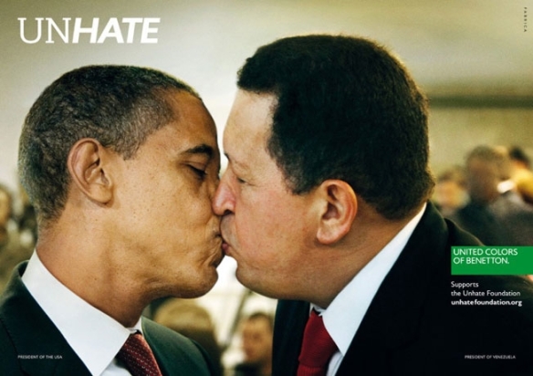
Having just posted about John Hegarty and his view on the state of current advertising (i.e. the ads aren’t good enough). It seems apt to look at the Cannes press Grand Prix winner.
Benetton’s provocative “Unhate” campaign showing world leaders kissing, created by Italian agency Fabrica with help from 72andSunny in Amsterdam got the prize.
Three executions were honored—the ones with U.S. president Barack Obama and Venezuelan president Hugo Chavez; Palestinian president Mahmoud Abbas and Israeli prime minister Benjamin Netanyahu; and German chancellor Angela Merkel and former French president Nicolas Sarkozy.
Absent was the campaign’s most incendiary image—a photo of Pope Benedict XVI kissing a senior Egyptian imam which was pulled almost immediately after the campaign broke last November.
Vatican spokesman the Rev. Federico Lombardi said in a statement cited by The Guardian, after slamming the image as “entirely unacceptable.”
“It is a serious lack of respect for the pope, an affront to the feelings of the faithful and an evident demonstration of how, in the field of advertising, the most elemental rules of respect for others can be broken in order to attract attention by provocation,”
The White House was not amused:
“The White House has a longstanding policy disapproving of the use of the president’s name and likeness for commercial purposes.”
Jury president Tham Khai Meng said that Benetton “has heart impact and gut impact and promotes a global debate”.
Steve Jones, a British juror at the French Riviera event said: “The reason we chose this is because it stood out on the wall… It’s not like traditional advertising. It’s not making a point about the clothes, its brand history. It doesn’t obey the rules.”
His sentiments were echoed by co-juror Komal Bedi Sohal, from the UAE, who added: “You can like it, you can dislike it, you can’t ignore it.”
The campaign was started in the ’80’s by Oliviero Toscani who was the creative mind behind the controversial work that turned Benetton into a household name.
Toscani was Benetton’s creative director for 18 years from 1982 to 2000. By the height of his success, Toscani was known for his arrogance and drama (and loss of perspective perhaps!), but his first campaign for Benetton in 1982 used teddy bears to model the children’s clothing line. More traditional than you might think.
Twenty-five years ago, Benetton shot to global fame with its controversial line and campaign – all the colors of the world (which became United Colors of Benetton). At the time, whilst controversial, this campaign seemed to reflect the irreverence of the brand as well as the physical nature of the product which featured a wash of primary colours.
The original United Colours was one of the great campaigns, differentiated from the category and relevant to the brand personality and primary product ranges.

Later efforts veered into the weird and wonderful – hearts, lungs, HIV tattoos and just-born babies come to mind.


I would argue that as the campaign veered off a relevant course for the brand (it’s a clothing line and store…), the fortunes of the brand took a nose dive. The figures prove it.
In the ’80’s when Benetton needed to generate awareness amongst a naive public, the notoriety of the campaign had an impact. It then became self-indulgent in the extreme and the company has not recovered.
There were a number of ads featuring HIV in one way or another, such as the famous photo of dying AIDS activist David Kirby taken in his hospital room in the in May 1990, with his father, sister and niece at his bedside. The photograph by Therese Frare, went on to win the 1991 World Press Photo Award, but whether or not this harrowing picture was an appropriate advertising image was widely debated. Some suggested it was more exploitative than supportive with AIDS activists saying that its use in advertising portrayed AIDS in a negative light, spreading fear rather than acceptance. The implied connection between the deaths of David Kirby and Jesus provoked outrage in many markets.

It is therefore very valid to ask if these latest Benetton Unhate ads represent the best on offer in press advertising, or are they just the most extraordinary and provocative campaign in market? If advertising success is measured by sales or by driving foot traffic to Benetton’s franchisees, this strategy and the previous campaigns have not worked.
There is no doubt that advertising remains a delicate blend of art and science. But I don’t agree that the industry is best served by rewarding the sensationalist approach of Benetton when it has lost all relevance to the brand. The Benetton campaign is art / social commentary, not advertising. The ad promises irreverence and a completely different perspective on the world today and all of it’s problems and prejudices that the stores, product and brand experience overall simply fail to deliver.
The judging at Cannes has come in for criticism on a few fronts. I would argue that it needs to return to the basics of effective advertising and the ability to sell a brand to its potential consumer in a relevant way, not just about notoriety, rule breaking or provocation. Great images that can change consumer opinion and sell the product at high return on investment should be recognised and rewarded.
Probably to “dry” for many, but this is actually how the industry survives. By sales.
As John Hegarty said at Cannes, advertising needs to stimulate and solicit the right response in the consumer along the lines of:
“Wow, I want to have a conversation with these people’, as opposed to ‘I’m doing my best to ignore them and they’re doing their best to trip me up in some way or another’. Isn’t that awful, we’re an industry that tries to trick people into watching what we do, why isn’t it inspiring, so people want to watch it.”
Benetton are trying to attract us by provocation rather than inspiration.
To some this might invite interest, particularly amongst social commentators and advertising aficionados, but I think that the shopping majority (and it is a mass market brand) will be confused by the aims of this campaign or potentially confronted by it, not inspired. Challenge and irreverence has a place in advertising, but it needs to be relevant and motivating to the brand.
Benetton Unhate is a great and provocative image, but arguably not a great ad.
I’ve glanced at the commentary coming from Cannes annual advertising shindig. A lot of local Australian reports have bemoaned the fact that local agencies haven’t swept the board with awards. In fact Australian agencies such as Clemengers seem to have done quite well?
It was therefore interesting to see John Hegarty who is founder and worldwide creative director of BBH, returning to the basics and telling the industry to pull it’s creative socks up in his speech at Cannes as reported in AdNews.

The great thing about John and his leadership of BBH is that he doesn’t change. His principles and practical approach to advertising remain basically the same, they just evolve with experience. I am biased having worked there, but it made a lasting impression as John was one of the best marketeers I ever met, as well as having countless creative credentials.
Despite the chagrin of many in advertising who are scratching their heads as to why awards and recognition aren’t flowing their way, John puts it simply:
“Make the bloody work better. We must be the only industry in the world that actually thinks you can succeed when the work’s getting worse. We don’t talk about this enough.
“Obviously Cannes is about this, but what are we doing about it, how are we changing the way we’re working to create better work.”
I think that this is outstanding for the fact that it is true, the fact that BBH have been at the forefront of creativity and that John has the guts to throw off the Emperors new clothes and look at the industry with fresh eyes as a respected veteran of the business.
Not to say that there isn’t great work out there. There just isn’t enough of it. There seems to be a lot of “lazy” advertising, dictated by the need to get the campaign on-air on-time. I’ve seen creativity rushed and ruined as a result of a notional deadline to get it on-air.
John went on to say that advertising needs to stimulate and solicit the right response in the consumer along the lines of:
“Wow, I want to have a conversation with these people’, as opposed to ‘I’m doing my best to ignore them and they’re doing their best to trip me up in some way or another’. Isn’t that awful, we’re an industry that tries to trick people into watching what we do, why isn’t it inspiring, so people want to watch it.”
The discussion about the effectiveness of introspective “teaser” campaigns (Commbank, Blackberry etc) falls into this bracket of trying to “trick” and entice people into guessing the campaign. This assumes that consumers can actually be bothered?
Advertisers being big (in spend terms…) with teasers and tricks, but not necessarily clever in terms of creatively attracting consumers, are then bemused as to why effectiveness awards allude them and their CMO’s are replaced every 18 months?
Consumers don’t like to be deceived or have to guess who or what is behind a campaign, even if advertisers think that this brings engagement. It is more likely to bring annoyance and antipathy towards the campaign and brand. Consumers are wise to it and the novelty has worn off.
Advertising is a tool to drive awareness, engagement and sales and should be judged on these parameters. Advertisers are at risk of talking to themselves and then wondering why no one is listening?
The truth is that advertisers are not making ads that are truly relevant, interesting and motivating and that reach a mass market quickly and efficiently with the message.
As John says the ads aren’t good enough. Many advertisers are seduced into making advertising for social engagement on-line and PR notoriety first. Whilst this is important in contributing to a campaign idea, it can’t replace the effectiveness of producing strategically sound mass market creative to impact consumers and change opinions into new behaviour (i.e. buying stuff).
What was the last TV ad (TV still reaches the most households), that made you say “I really want that” or “they look like a great company I want to hear more from” or “wow, that changes my opinion!”
Hopefully hearing this from John will provoke the industry into some positive thought and action.
His book lays it out pretty clearly and is boiled down to the basics of the two most important points to remember if you’re a creative:
• The truth is the most powerful strategy
• The power of irreverence
The truth of product propositions seems to be getting lost in the “art” of advertising. The same rules still apply. Great products and services with genuine unique selling points (product truths), creatively delivered to attract the attention of consumers – this is what still works and sells.
When it comes to handling a situation or tackling an idea, John couldn’t stress more the importance of these two aspects of truth and irreverence in his book. Ask yourself, what is it exactly you’re trying to do? You should always challenge the accepted norm. Of course, he highlighted the fact that when it comes to clients, you can’t always break prejudice, it’s all about how you make the limits they give you distinctive. A nice challenge to the traditional brief.
He follows up with the first of many interesting anecdotes, featuring one of the most influential creative minds in advertising, Bill Bernbach. After the Second World War, Germany’s economy was kaput and they were in desperate need of a boost. One of the key elements they had to offer was their cars and they needed to sell them badly. They decided to approach an American named Bill Bernbach to try to generate sales for the Volkwagen Beetle. Now here was a car which was completely unappealing and actually not all that good, but Bernbach saw an opportunity in advertising a key feature about it. It was small. In this world of everything getting bigger, and bigger meaning better, Bernbach identified that the beetle went against the grain, and instead of trying to hide from supposed disadvantage, he turned the spotlight onto it and came up with the now famous line: “Think small”…and as they say the rest is history.
I hope that John and his blunt appraisal drives clients and creatives to make history and produce the campaigns that the industry can be proud of and that the consumers deserve.
Just when I thought that this campaign was on-track to deliver justification of the Toni Collette “Can” campaign via press and outdoor, this ad pops up?
Perhaps the budgets of the bank are indeed bottomless.
I get that they sponsor James Magnussen (whatever benefit this brings…), but what is the relevance to banking here or the campaign?
Entertaining perhaps, different certainly, but we were promised that banking would be different with CommBank who “can” deliver for us? This is delivering a swimmer to the Olympics via some larrikin letters?
Surely banking is governed by the same KPI’s as the rest of the marketing world – sales and service levels of satisfaction. Perhaps awareness of this sponsorship was the objective, somewhat confused by “Can” versus the letter “T” (very Sesame Street)
I fail to fully understand where this Can campaign strategy is going. Toni Collette, to rational press and outdoor, to gimmicky support of sponsorship…I’m struggling to see the wood for the trees. I wonder if potential customers are as confused? Banking is serious business and CommBank seem to be taking a very light approach to attract customers purely on emotive values.
If loyalty is a function of trust, I think that the new NAB campaign is doing a better job. Staged stunts perhaps, but I think the mass market majority will come away with the feeling of trust and security that a bank wants to impart. I particularly like the “spelt my name wrong” comment – adding some much needed authenticity after the slightly over done walkie-talkie dialogue:
Oh to have a bank’s budgets…
Here’s something that doesn’t demand too much thought.
Hyundai are pitching freedom.
Maybe not that unique when it comes to cars, but nice to see a more creative execution rather than the happy family / cafe couple that we usually get bored by.
Innocean creative director Scott Lambert said that the ad represented a departure from Hyundai’s traditionally “sophisticated, clean style of commercial for a more emotive feel”, with more colour and tone than the brand usually employs.
The rights to the music cost “around $200,000″ – so we might be seeing more of this…and at least at that cost the music is central to the creative idea. The supercut editing is nicely done and you get a look at the car and features – the sun-roof, radio etc. All done in a way that entertains and communicates.
A bit more real and a lot more noticeable.
After much anticipation (in ad circles at least) Woolworths aired the new campaign from Droga in last nights high rating spots. Here is the corporate line:
“Today we embark on a new journey for our company. We have a proud history at Woolworths of bringing Australians outstanding fresh food and value. We are building on this and our new campaign marks the start of a new promise to our customers as ‘Australia’s Fresh Food People’.
“A new ad campaign, which commences tonight, features nine real Woolworths Fresh Food people. Our renewed focus on our people is testament to the faith we have that Woolworths’ people are our greatest asset.“Coupled with that is our new theme song, which highlights the rhythm of the seasons and celebrates that every day, every week, every month of the year, Woolies people open the doors to our stores and bake the freshest bread, serve the freshest fruit and veg and the best quality Australian meat and seafood.
Interestingly the music, written by Frankie Carle‘s “Monday, Tuesday, Wednesday, I Love You” has been used previously by Walmart. The track was re-recorded by Gossling (Helen Croome) in keeping with the original recording by Kitty Kallen with Lawrence Welk & His Champagne Orchestra and made famous by Betty Driver
In a nice twist, Woolworth’s have given you the chance to download for free on their website
The ad is about Woolies people and continues to push the “Fresh Food” promise via these people. I really like the simple, but effective introduction of the word “Australia’s”. Home grown provenance is a big motivator (…if at the right price!)
Many analysts were expecting a bigger leap forward from the new agency, but this is a mega-brand making it’s move and nothing is done without careful consideration. The tone of these ads brings a freshness that has been lacking and does differentiate from Coles celeb advocacy approach.
People are important, but product and prices are dominating the supermarket wars at present, which Coles are perceived as winning through delivery of this message with strong personalities in the Curtis and Dawn ad that resonates well with the viewer.
This ad delivers “year round” love of Woolies by Woolies fresh food people. It demonstrates what we assume are real employees and suppliers who love Woolies. But why should we love Woolies?
It is an expensive looking and beautifully produced piece of work. Watchability is right up there and I actually believe that these people are who they claim to be, which is important in advocate advertising. But is it effective advertising in building loyalty?
The question as to why consumers would love Woolies remains. Seeing people at work in farms, fields and stores might not be enough to give people reasons why Woolies is really the “freshest” in the cut throat world of battling Coles.
Fresh Food People needs qualification since Coles came into the argument. The ad is relevant, certainly interesting, but the motivation for a consumer to believe the Fresh Food promise and why this if different to Coles is the key deliverable.
Assuming people will click into the website for more answers is a big assumption – on-line is the domain of range and pricing (as shown in the great Woolies app). Without this step, there is no qualification to the promise?
Here is an example of what people see when they click – Malcolm the farmer talking about running and potatoes. There is actually some motivating news in there, but should this be the main ad (apparently 12 ads will run so it might well be)? :
Hopefully the campaign develops with rational product and price proof points, still delivered in this strong emotive style to entice the shoppers – perhaps less sexy advertising, but potentially more motivating in today’s climate.
A couple of other interesting points to note are the subtle re-brand (Woolworths moves from red to green). And as reported in Mumbrella, Woolworths will remove walls to behind-the-scenes areas of its stores so that customers will be able to see bakers and butchers in action. The brand will also refit stores with better lighting and address checkout queues. (My local Woolies did this 3 weeks ago by moving the stacked special offers from in front of the tills – and it is still talked about in hushed tones down the aisles…!)
Great advertising engages and entertains, but ultimately needs to sell to us by delivering reasons to believe in the brand promise and motivate us to buy and remain loyal.
Hopefully this campaign will deliver the rational reasons, as well as the feel-good fresh food people.
Advertising never fails to surprise.
Often as a result of marketing and advertising professionals desire to be “different”.
Sometimes with ground breaking results, from brave, bold insightful clients partnering with strategically driven, experienced creatives.
And sometimes quite the opposite, as we see in the campaign from Harvey Nichols.
I believe a lot of this desire to be different is too introspective. Does it really put the consumer first and show any true insight about who they are selling to and how best they should do it?
I imagine (totally cynically of course), the process to be something along the lines of… client and agency discuss the consumers as “irrational, hand-bag wielding crazies” at the prospect of the sale at Harvey Nichols.
A bed-head, 30 something year old creative in ripped jeans and sullen attitude suggests that the poor punter might even “wet themselves” at the prospect of a bargain in the hallowed halls of Harveys!
Amidst the giggles and guffaw the idea becomes “irreverent” and “break-through” and here is the result. An actual campaign (a lot of direct mail money was spent on this…), around consumers wetting themselves in anticipation of the sale.
Julia Bowe, group press and marketing director, at Harvey Nichols said: “In the past we’ve experienced everything from customers camping outside the store overnight to be at the front of the queue, to fierce tussles between over-zealous bargain-hunters on the shop floor.
“In humorous reaction to the often-irrational excitement sale time engenders, we have developed this campaign to capture this near-fanatical spirit.”
Jeremy Craigen, executive creative director at DDB UK, said: “I wet myself when I saw this idea. That says it all really.”
It certainly does. Both client and agency are pretty far removed from their consumer.
The controversial campaign comes after the company narrowly avoided a ban from the Advertising Standards Authority for its notorious “Walk of Shame” advert, which ran on TV last December. A deeply disturbing effort at advertising.
This is a symptom of the “anything goes” prevailing advertising attitude. Or it might be more accurate to say “anything can be sold” attitude with respect to the client…
This campaign, although claiming to be tongue-in-cheek, (which has become the most often used term for poor taste in a tepid idea), mocks the consumer and devalues a premium brand.
What does the person in the street think? Particularly the aspirationally premium target? I doubt many share the same sense of irreverent humour about their excitement in the sale or relate to the image and see themselves as losing bowel control for the chance to grab a bargain. Advertising can no longer hide from their consumers who in this case have taken to twitter on receipt of the flyers with the images as reported:
This campaign suggests the client doesn’t exactly put their punter on a pedestal in terms of premium perceptions, or even understand who their customer is?
I tend to think these ideas are lazy and exist in the absence of any strategically inspired creative idea that is truly relevant, interesting and motivating to the punter and potentially drives sales.
A lot of the PR generated by the campaign tends to agree. The “accident” is all Harvey Nichols, not their consumer’s…

This won an award for advertising in the recent Vimeo awards which brought it to broader attention after it’s launch last year.
It’s not often that you see a brand take such a left turn in it’s promotional thinking
K-Swiss the American footwear brand, has won recognition for the Kenny Powers campaign spun off the fictional character’s appearance in the HBO series Eastbound and Down.
The MFCEO campaign won K-Swiss Client of the Year at the One Show Awards, along with three Gold Pencils for Non-Broadcast/Online, Branded Content/Online Integrated Branding/Consumer Campaign as well as Vimeo recognition.
Danny McBride appears as Kenny Powers, the CEO in an online campaign. The campaign included billboards in Times Square and Venice Beach, a campaign micro-site, New York City subway posters and a 1-888 number where callers could call and hear an inspirational message from Powers.
One of the more interesting and risky brand initiatives that has propelled K-Swiss upwards in the “cool” charts…and very unusual for American advertising.
The Blades launch is quite something (there might be some strong language in this one…!).
It’s an interesting question – what is acceptable in advertising? This keeps winning awards and the ex Adidas marketing chief who commissioned it is supplying sales figures to say it works. Humour is often subjective, but this was a proven character from HBO’s Eastbound and Down and using Kenny was less of a risk than it might appear.
It certainly forces a reappraisal of the brand and this association will stick for a while, not that the company is moving away from it, more ads are in production with Kenny.
One things for sure, these ads make a statement – irreverent and without apology, differentiating the product from everything else on the shelf (and in the store!). That’s why I like it. Bold and brave, but hopefully not foolhardy – time will tell.
K-Swiss are committed and are on a roll.
http://vimeo.com/everynone/symmetry
A truly original piece of work that won an award.
It provokes some emotion and thought, ending on an interesting juxtaposition…
I like the Bonds work. It is in the main simple and is based on a great product demo (even the underwear). It sells you the stuff in an informative, unique and entertaining way.
I particularly liked previous efforts such as Rollerskating. Good clean fun and famous for it.
This is nice, but as they have hit the nail on the head with a great track – Whip it by Devo, they might have been a bit more inventive in the execution – a few more naughty babies perhaps? I’ve got one if they were struggling…
I used to think that Lynx prided themselves in clever advertising.
Lynx have built a brand around the promise to pre-pubescent boys that using Lynx makes you irresistible to the opposite sex.
This has been done with wit, irreverence and a clever tongue in cheek sense of humour to the most part.
This latest work featuring Sophie Monk (a red flag in itself) was directly, scene for scene, copied from an existing AXE ad in the US? Surely just looking at the US effort would force you to question the merits of this campaign, not encourage you to repeat the mistake?
The online ad exploits the hilarious double entendre of the phrase ‘clean your balls’ as Sophie Monk demonstrates the grime-removal strength of Lynx gel on “hairy balls” (tennis balls), “saggy balls” (deflated medicine balls) and an African American man’s “big ball sack” (a netted bag of soccer balls).
3 minutes of the same puerile joke.
No sitting on the fence, no excuses, it is an absolute shocker.
It was done in conjunction with ZOO magazine and is described as
“provocative, tongue-fully-planted-in-cheek campaign”.
Really?
I think they got it very wrong.
Even more amazing when you also consider that the ‘Clean your balls’ campaign follows Lynx’s controversial ‘Rules of rugby’ campaign which was removed at the behest of the Advertising Standards Bureau last year after complaints that it objectified women.
Collective Shout, a lobby group that campaigns against the sexualisation of advertising, has put in a complaint to the Advertising Standards Bureau.
Tankard Reist, co-founder of Collective Shout said that:
“objectifying women” in these “hyper-sexualised scenes” is actually harmful, adding: “They contribute to an ongoing second-class status of women.”
There is a big difference between “sexy advertising” or irreverent tongue in cheek humour and bad taste and there is no excuse for suggesting that this is what the target responds to. A few people have used this generalisation in support of the work. It actually suggests a level of disregard for the target’s ability to comprehend a clever piece of advertising and justifies cheap work that throws the industry back 10 years.
Previous Lynx work (ref Angels or Anarchy House or Snow Angles ) is far superior to this effort, generating a much more aspirational and positive brand image and Unilever should prepare themselves for a trade (if not consumer) backlash.
As Mumbrella said:
“One hundred and eighty seconds around one double innuendo. Somebody had to come home from work knowing that they made this”.
Dee Madigan, the respected creative director of Madigan Communications and a panellist on ABC1’s The Gruen Transfer, said the Lynx ”cleans your balls” advertisement was suited to its target audience.
”Young males like to go against the grain,” she said. ”Doing something sexist and offensive, that’s kind of the strategy.”
I couldn’t disagree more. This is confusing irreverence with irrevocable bad taste and poor advertising, defended by a lack of insight on the target. Industry figures should strive for a smarter, aspirational solution otherwise the industry will continue to be derided by on-lookers.
Not what the brand or industry needs and surely Sophie Monk isn’t that desperate to get work?
And as a postscript, the advert has (finally!) been censured after a slew of complaints to the ad watchdog.
Bizarrely, the Advertising Standards Board (ASB) decided that the ad was not derogatory to women, but said
“with the exception of the depiction of the older man, the depictions were not offensive or demeaning to any person or section of society”.
Not so sure myself!
The Board noted the concerns that the advertisement is offensive and discriminates against elderly men in particular as it refers to their “old saggy balls not being played with for years”.
The Board considered that the older man is depicted in a negative manner with the inference in the advertisement being that the older man does not receive any attention due to his age. The Board considered that this is a negative depiction of an older person and that this depiction does amount to discrimination against older men.”
In response to the findings Unilever said:
“The men who appear in the commercial are representative of a wide range of age groups, from young to old, and all of them are portrayed in a humorous and good-natured way. It was never the intention of the commercial to discriminate against elderly people”
The elderly man is an object of ridicule. Unilever should not try to defend the indefensible.
A classic case of misinterpreting “irreverence” and “tongue in cheek” and stereotyping men and women – not clever work at all.
But if Unilever are repentant it is interesting to see them respond to the censure of the ‘clean your balls’ ad with a new online video featuring a mock press conference loaded with more dirty ball references
This campaign is still creating lots of trade talk.
I for one was critical of the fact that the promise of what the bank “can” do was not delivered in the TV ad.
As suspected, the follow up justification is now coming thick and fast.
As a rational message I like the press. Particularly the simple, clear and well branded message endorsed by a gold medal.
More of this and the consumers have a real reason to look at the claim and the bank.

So often we are told “what to do and what not to do”.
Seldom are we convinced of what we as individuals or society “should” be doing and why.
Government bodies have lost the art of advertising in favour of preaching or scare tactics.
This UK Cancer Council ad has a beautiful mix of advertising art and science. It intrigues you enough to interest you, hold your attention and then delivers a concluding message that is both powerful and absolutely believable. No drama, just the truth presented in a motivating manner.
It is completely relevant to the argument about plain packaging and will do more to motivate change than any number of government polls and opinions.
A great example of advertising resolving a complex argument with a simple and effective execution.
I like a mix of rational and emotional values in advertising.
I’m often looking for the rational message – the sell, presented in an entertaining and engaging way. This for me is the essence of good advertising.
Here’s a new spot for Etihad that offers you the promise that Etihad are better and invites you into some website answers. The site gives you some super facts and figures to support the reason why so many people switch to Etihad.
Things like:
But you need to click to find it. http://www.whyetihad.com/global/en/ once clicked this is a convincing site and could increase consideration of Etihad.
But it is very rational, a lot of facts and figures, very static and with no pictures of people on planes (…a bit obvious, but the best demonstration of in-flight service). Virgin Australia did a nice job of cramming in the facts to a very entertaining ad with premium appeal and pace.
The experience of flying is becoming commonplace, but people still need to feel it is an experience that they can enjoy rather than endure. It is still a service based industry.
How much more motivating if we were shown specifics of service in the Etihad spot? Or better still, if so many people have switched to Etihad, this is inviting advocacy statements from customers – one of the most powerful sales tools as seen with Emirates. My mum now swears by Emirates…economy not first class (…when is too much really too much!?)

Also no mention of sports on the website? By their own admission, Etihad is “mad about sports. We sponsor Manchester City Football Club, Harlequins Rugby Team, the Scuderia Ferrari F1 team, the GAA Hurling All-Ireland Senior Championship and the Abu Dhabi Golf Championships.”
As a part of their strategy this is a big plus to the large percentage of people who also love sports and worth mentioning (particularly at Man City and F1 prices…)
But back to the “click” strategy – in an age of immediacy, it needs to be a big promise (usually prizes) or intriguing question to get people to click and justify claims in an ad or to find out more about the product or service.
The proposition for the airlines is multi-faceted. Particularly profitable premium routes where it needs to combine price and service to give great value. Traveling 14 hours means you need some comfort, entertainment and service as well as an affordable ticket and the security of knowing it is a major carrier with all the safety and efficiency you expect.
A lot of these answers are there (even if the in-flight experience isn’t best explained), but I think if you are making a big statement such as “people prefer us”, it makes the statement more effective to qualify it there and then in the ad. This ad could have had multiple variants which answered the “why” with a few of the reasons.
One argument for the “click and go” strategy could be the global usage and language variants, but advertising works pretty much the same way in any language. Asking consumers to click into a website to justify the claim is tough.
The casting (particulalry the sun bathing couple?) and CGI in the ad implied a tight budget and unfortunately it shows in the finished product. This is relevant when airlines have traditionally put all the bells and whistles into the ad, even Garuda has a touch of glamour.
The hidden gem in the website was the economy claim. Whilst premium expectations are all about service pre, during and post flight, an economy trip is nicely summarised by this which perfectly demonstrates the improved service and has a nice impact:
Commbank has succeeded in getting a lot of attention through a teaser “can” campaign and launch ad with Toni Collette as posted below: Can
We now see the follow-up.
I was anticipating a bit more of a hard sell on product and service based attributes?
The “kaching” app is nice (any fees?). But the beleaguered commuter and lollipop ladies aren’t really selling me much of a service and I think a more motivating proposition is to give the potential customer real, rational reasons to switch banking based on leadership.
I still think the campaign needs to convince consumers why Commbank “can do something” no one else can or how Commbank will do something better than the others?
Hugs and feel goods don’t have the relevance, interest and motivation to get me through the door. Bank rates, service delivery and unique products other than apps could…
Here’s the series as launched:
Nice ads and well executed, but is a nice bank, with feel good friendly representatives enough to convince consumers to act in testing times?
The press which appeared after this post, does the best job so far of putting the rational support behind “can” (Can Press Campaign)
Interesting to see Mumbrella report some consumer feedback…

14 million views on YouTube and still going strong.
I’ve often eulogized the Nike work. Their access to and use of stars is often exemplary, but does this one go too far?
It is a promo that invites you into an interactive on-line opportunity to “find out what it takes”.
All very slick as you would expect, but is it too much?
With a wealth of talent at their disposal, everyone is in this spot Neymar, M’Vila, Götze, Ribéry, Sneijder, Ronaldo to name a few. Even Lebron James is crammed in there!
A case of not seeing the wood for the trees and not getting the best value out of priceless talent?
Obviously Nike and football have moved onto the global stage, but I still prefer some of the more tailored work – any excuse to show Park Life again:
After being teased with “can’t” we now see the “can” campaign in full from Commonwealth Bank.
Much has been written about the merits of the teaser campaign, about those that ambushed it and if it was effective against the target, assuming that we know who it is targeted at and what effect “teasing” has on a target inundated with advertising messages? I think “teasing” is a figment of the agencies imagination and the consumer rarely notices the message, despite a massive amount of expensive media.
This campaign has plenty of polish. M&C Saatchi work their magic in film and their creative team wrote a very nicely crafted poem as well (see the bottom of the post for the words), delivered impeccably by Toni Collette, who is surprisingly appropriate for the tone of the ad.
You are invited into the prospect of a great big brand reveal in the ad. Nike? A charity? Perhaps a vocational career? Saving the world or rain forests?
And then it’s a bank?
Some more cynical consumers might say that banks are the antithesis of “can”. They could pass on the interest rate cuts in full, but “can’t” due to the bottom line, economy, shareholders etc. Banks certainly suffer in a financial crisis and are often and sometimes wrongly (who helped me buy the house again…?), portrayed as the pariah of the masses. They are arguably no longer a badge of honor for employees – all post GFC issues that are very real if you are trying to attract and retain customers and the best staff.
So back to the bank ad, it positively glows with warmth and radiates assured positive vibes…the choice of Toni and the strategy to read a nice poem about the “possible” entertains and entices beautifully. It is a very slick, simple piece of work that you enjoy viewing.
But what is it aiming to achieve?
I wonder if a large part of the client “buying” the campaign is to do with internal communications? If all Commbank staff adopted a “can do” mentality, the customers might be happier which equals more money and happier staff, which equals happier customers and more money (over simplified I accept).
I am less certain about the relevance of “can” to the bank’s consumers when delivered so conceptually via a TV ad. Are people likely to be left feeling inspired, perhaps taking up that hobby after all, but left confused about what it means to their banking?
The consumer might be doubting the message given their experience.
They might be thinking where is “can” when they ask if they can lower their interest rate on the mortgage, or when they ask if Commbank can better a competitors rate? The “can do” concept is contrary to the current perceived truth and I am left wondering what facts back up this “can do” claim? If there are new products and services in this regard, the campaign could be a golden opportunity to make this known? If this is a precursor to all the answers about what Commbank “can do” then it could develop nicely. Perhaps if you go in and ask you just might get a deal (…a bit like Bing Lee)?
But this particular ad is all about emotional not rational values. And perhaps this is where it misses an opportunity to “sell” in the minutes worth of poetic action. Why not do both?
Advertising should close the deal. It should engage you emotionally and entertain you, whilst convincing you rationally of the product or services it wants you to buy. It is a sales tool (sorry, but it really is). It gives you reasons to believe and then act. With a significant media spend on TV, I feel both emotional and rational messages should be in the ad to drive engagement and “sales”.
This is arguably a very unfashionable and even old-fashioned view of the art of advertising. One held by the likes of John Hegarty, Dave Trott and the like (try DT’s blog for more).
Consumers should be credited with the capacity to look at advertising and discern the sales message amongst the shine of a polished ad. This is what great advertising does – engage and sell.
I may be doing a disservice to the Commbankers who will certainly have a clever “can” direct mail out there, giving some rational reasons as to what Commbank “can do” tout de suite! This could be the entrée to a campaign about all the proof points as to why Commbank can? But such a good ad would be a great ad if it delivered a reason “why” or “how” Commbank “can” in these 60 seconds.
The current reality is that the press is full of contradictory stories on the problems in the sector and Commbank has taken a fair share of criticism over job cuts and mortgage rates, leaving consumers with a different perception of the product to that presented in the ad. and testing the credibility of the “can” promise with consumers. Consumers are suspicious of banking institutions and are lacking confidence in their motives.
This ad is wonderfully produced, full of emotional engagement, but what is it hoping to achieve without some rational reasons to believe in the bank’s products and act? Maybe the next bit of the campaign is the hard sell?
Commbank doesn’t need to build awareness, it doesn’t need to change the colour of the logo, it needs to change negative attitudes based on what consumers perceive the banks to be and give skeptical people rational reasons to move from their bank to Commbank. The hardest bit is done – it captures the attention in a positive manner, but what am I motivated to do?
I don’t think that the current mortgage rate and GFC driven negative perceptions to banking / individual banks can be altered by just the warmth of a positive, well presented, but ultimately generic “feel good” statement. This is a luxury most advertisers can’t afford and most CFO’s won’t support. Customers treat this category seriously and need compelling reasons to break up with their bank and get a better deal elsewhere. This isn’t selling cosmetics it’s selling control and care of your cash.
The excellent NAB ads: http://www.youtube.com/watch?v=BDbvAEcP_2k took the decision to be “on your side” and “break up” with those other bad banks. BUT it also had one of the lowest mortgage rates of the high street banks. Clever, creative and insightful advertising backed up by a strong product proposition.
ING got it right with a simple, well branded ad that showed the interest rate. Less likely to win awards, but more likely to win customers for who it is relevant (I want to save money), interesting (orange apes?) and motivating (the best rates).
The Saatchi and Commbank marketing team are all top players in the game. As noted, this could be the opener to a campaign full of answers for the rational side of the pitch of new products and services, all predicated with what Commbank “can” and will do for you.
They have a new set of TV ads out here…New Commbank Campaign so judge for yourself. I think the best rational support is delivered in the press ads posted later here: CommBank Press Campaign. The most recent work takes yet another direction with James Magnussen.
Ultimately I still believe that this TV creative could have been a much more effective ad if it had the rational “what we can do for you” sales message incorporated, complementing the engaging entertainment. A much bigger creative challenge, but with much greater rewards.
But hang on…What about BT?
An interestng post script to this high-profile campaign are the reports in Mumbrella and AdNews of plagiarism, even if it is from the same agencies earlier work in 1999 for BT in the UK. The similarities are striking – the original BT work was pitched as follows:
“Focusing on the idea that chief executives hate the word ’can’t’, poster sites on major routes into London will initially carry a teaser campaign reading simply ’Can’t’.
“After a few days, the teaser will be transformed into ’Can’ with paint, eggs and graffiti, above the line, ’BT. You Can.”

An interesting conversation between agency and client no doubt as it potentially takes the polish off this one, but then how many ideas are truly original and who but a few of us actually remember 1999?
Ode to Can.
There’s a four lettered word
As offensive as any
It holds back the few
Puts a stop to the many.You can’t climb that mountain
You can’t cross the sea
You can’t become anything you want to be.
He can’t hit a century
They can’t find a cure.
She can’t think about leaving or searching for more.
Because Can’t is a word with a habit of stopping
The ebb and the flow of ideas
It keeps dropping
itself where we know in our hearts it’s not needed
And saying “don’t go” when we could have succeeded.But those four little letters
That end with a T
They can change in an instant
When shortened to three.
We can take off the T
We can do it today
We can move forward not back
We can find our own way.We can build we can run
We can follow the sun
We can push we can pull
We can say I’m someone
Who refuses to believe
That life can’t be better
With the removal of one
Insignificant letter.
Any good and fair work done by CommBank (plagiarism aside) has been potentially ruined by their on-line attempt at humour – a joke set in London featuring a back-pack bomb hoax. Now removed by CommBank, but widely reported. Interesting proof if it were needed of the reach and impact of some viral on-line efforts.
High Profile = High Parody
As a more lighthearted close, here is a Sportsbet parody of this more than earnest effort by Toni. Sportsbet have offered a ‘can can’ dance off to see who would host each others ad for 24 hours and donate $50,000 to charity – CBA declined on the basis that they don’t gamble with charity donations (…and this is more NAB territory!). Perhaps they might have chosen a more human answer and capitalised on this PR opportunity?
And Finally…Gloss vs Gold?
So after all is said and first posted, what is the final (final!) take on the campaign?
Fundamentally I think that this is a big idea. Nice to see.
An idea that relies on a big voice and a lot of support in all areas of the business. Also being executed well in terms of spend and ‘touch points’
It started in a esoteric, ethos sort of way, which lost it for me – a bit too much emotion without the support. It subsequently (and as of Sept) has reverted to much more traditional ‘proof point’ rational advertising. Saying exactly what Commbank can do. Not award winning, but useful delivery of attitude changing info with the emotional engagement of a can do attitude:
This is an idea with many, many facets to the campaign.
I still believe that the campaign would have been more effective in changing hearts and minds if the campaign that melded the emotional and rational messages from the start. It is always a lot to assume that people follow every twist and turn of a big campaign. However loud it shouts.
A lot of money was spent saying ‘can’ and teasing the consumer into being interested. Despite the new sexy image of banking, I still don’t think finance is just about the gloss (the poem opener) when people are counting their gold (i.e. what is the best rate for me?).
Perhaps more might have been devoted to ‘can do what exactly’ from the opener?
And some of the best, most innovative things Commbank have done – make a Kaching payment app in the face of an amazing omission from the new iPhone, and give your iPhone an invaluable tool to look for and buy your new house.
Nice to see something different generating plenty of opinions.
This excellent post from John Willshire re-inspires Marketeers.
Consumer / customer insight and understanding is at the very core of this work. As is the “truth” about brand and product delivery i.e. it needs to have a purpose and serve a role.
It neatly details “Why the future of marketing depends on rebalancing our choice between creating demand, or exploting demand. Make People Want Things, or Make Things People Want”
Worth taking 204 clicks of your time to enjoy some strong strategic thinking expertly delivered.
You probably need to be English to get the most out of this. Which in itself is a great compliment to the spot – it nails the England fan mentality.
There are also very good choices in casting: headed by Des Lynam featuring England legends Bobby Charlton, Peter Shilton, Stuart Pearce and Ian Wright; actor Brian Blessed; ex-Olympic gold medallist Linford Christie; explorer Ray Mears; and TV presenter Helen Chamberlain serving pies.
But at the end of the day, stirring that in-built passion for the great game is going to bring rewards.
You might even feel that Carlsberg are in this one with you…before you realize that it is Danish brewing company founded in 1847 by J. C. Jacobsen after the name of his son Carl. Not very English really.
Interesting to see Carlsberg getting it right for the market and continuing a strong campaign of understanding who they are talking to. The watchability is great (to the England fan at least!)
As the Europe and football fans everywhere look towards another Euro 2012, there is a flurry of advertising activity from the likes of adidas, Carlsberg etc.
But of all the choices, I think that the ITV effort gets top marks.
For a TV promo. it is pretty good. And if we were talking about an agency, we might even say there’s a good insight on the beleaguered English fan thinking (dreaming) of what might have been.
Above all it is entertaining and gives you a positive feeling about ITV and perhaps a stronger inclination to watch the channel where you have a choice.
Some great little insights that show what might have been. I particularly like the Gazza (Paul Gascoigne) monument in place of the “Angel of the North” and the Kevin Keegan references (bias of a Newcastle United fan) and if only Maradonna had been sent off!

I believe in the “truth” in advertising – that is the fact that creative scenarios are relevant, interesting and believable to the people who they are targeting.
This is critical in talent use. A previous post on Beckham and Beethoven shows that “making it up” doesn’t cut it. The joke or demonstration of skill needs to be genuine.
Pepsi have developed this film with Australian-American basketball player and 2012 NBA Rookie Of The Year, Kyrie Irving, in disguise as a fictional character named “Uncle Drew”.
It plays out in a really believable manner – you see the surprise and delight is genuine in the crowd. As it develops it becomes truly entertaining as Uncle Drew turns it on.
The branding is light. A couple of pack shots and credits.
But because of the high level of engagement, it works. This is creative content that is clever and attributes a lot of brand value to the guys who thought it up.
3 million plus views and the associated talk-ability prove that the effort is worth it.
Great talent is also important – the film was written and directed by Irving.